Home Renovation: Quarantine style

Home Renovation: Quarantine style

“When life gives you lemons cut them up and put them in your sweet tea”

With the Coronavirus becoming a more public health issue and now that we all are staying at home to help flatten the curve. Spending more time in our homes is leaving us lots of time to look at those spaces that just don’t feel like home.

While I’m spending time designing for my wonderful clients I usually have a long running list of renovation ideas I’d like to work on at our personal home. Sometimes it’s in the area of updating lighting with a new statement chandelier or brightening up the mudroom with new colorful fun wallpaper. Just as we finish a project, I always seem to get inspired to add something else to the list (as my husband reads this he is probably saying… yup, that’s Melissa).

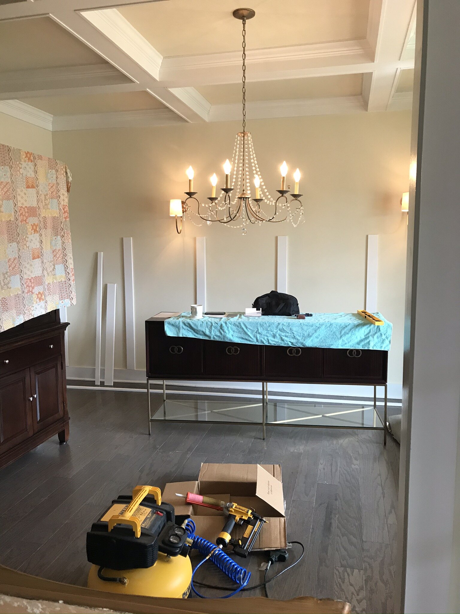
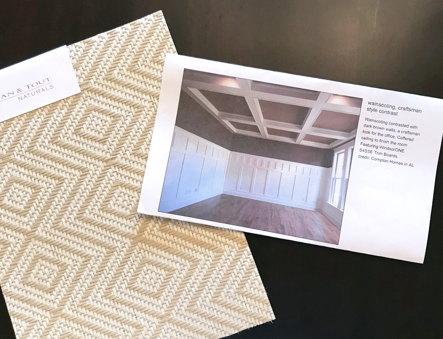
I thought I would take this moment to share that I have those same thoughts as you and share a glimpse into my own home. With time on my side, my mind started to run through that old project list. I pulled out my “mood” board (design inspiration pictures) and convinced my husband that there is no time like the present… and off we went! The goal of this project is to add character to the “vanilla box” called the Dining Room. When we moved in five years ago I added some window treatments but it lacked charm. The rug wasn’t the right size since it was from our old home and the walls and the ceiling is all the same vanilla color. Although not a bad space, it wasn’t me.

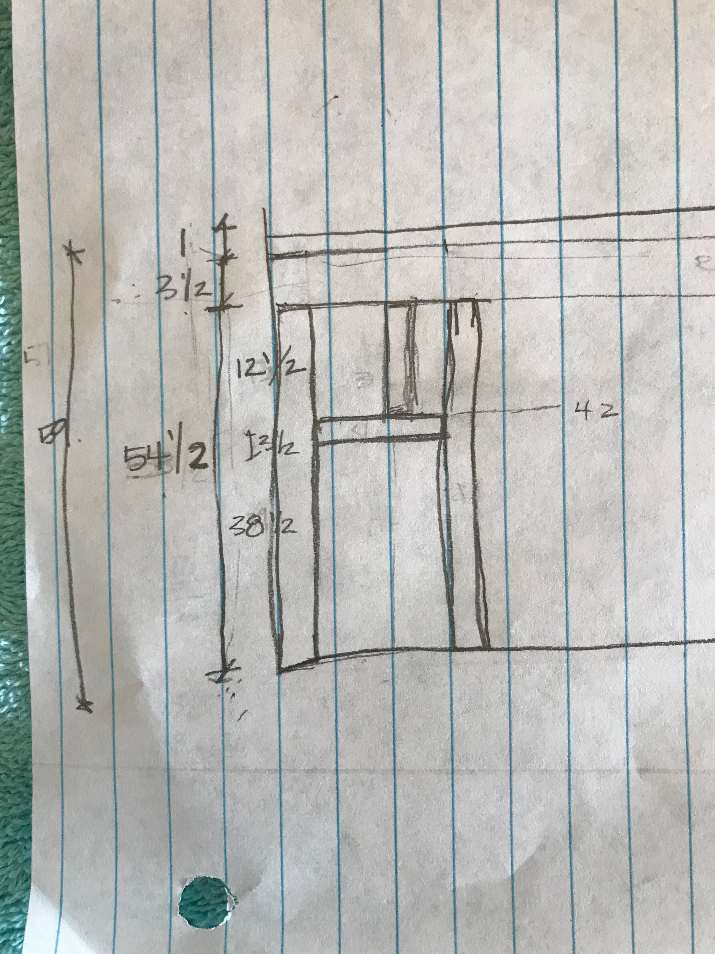
The first step was the design of the wainscoting. I measured out the walls and began to draw them out - for this project I went old school style and used paper and pencil.

Once the design was set and the materials list created, I marked the walls with the dimensions from my drawings. And my husband was tasked with cutting the wood. Remember - measure twice, cut once!

The wood was attached to the walls using liquid nails and finishing nails….man that was a fun toy to use!

We added a top cap that mimicks the top cap moulding on the doors. This helps to make the wainscoting feel natural to the space.

Painted Ceiling.jpg

After spackling and sanding, the home stretch arrived. Painting. I had been pondering for a looooooong time on whether to wallpaper or paint the coffered ceiling…..a light blue high gloss paint is the winner. A soft blue paint has been filled in each segment to create a more dynamic fifth wall design treatment. The focal point of the space is a painting that has been passed down in the family for generations. I used that painting to find the best shade of blue for the ceiling to feel continuous with the sky in the painting. [While not pictured, this became a family painting project with little helpers joining in on the painting.]

We still have some work to do for the final touches: installing wallpaper and updating the window treatments. You can see how during this quarantine, we can still tackle those home renovations. Even a small change can make a huge impact. The room is already looking brighter and more flavorful! My vision is finally falling into place nicely.

BEFORE

AFTER

You most likely have a list like mine and Mathe Design is here to help you with those lists. We can do digital room design and procurement as well as have sub contractors, who have been screened to help on the inside, too.

Cheers!

Melissa Mathe

Contact us for all your Interior Design and Decorating needs @mathedesign.com

Colorful Painted Doors To Love

Colorful Painted Doors To Love

“Why fit in when you were born to stand out.” ~ Dr. Seuss


Along with the bursts of color in Springs freshly bloomed flowers and foliage. We couldn’t help but notice a number of newly painted colorful doors popping up while driving onsite to projects. With a new season comes the perfect time to change things up and refresh the curb appeal of your home. One of the most cost effective things to put into a house is paint. We’re sharing some of the colors we love and a few sources in case you happen to catch the color-pop door painting bug this Spring.

Nesting With Grace

Nesting With Grace

An inspirational and optimistic color… we could see this matching most greenery wreaths year round.

Sockeye (SW-6619) by Sherwin Williams

Sockeye SW 6619.jpg
Country Living  Photo: Brian Woodcock

Country Living Photo: Brian Woodcock

A sunny color to channel bright and new things in life.

Canary Yellow (PPG125-4) by Glidden

Glidden Canary Yellow_PPG125-4.png
Southern Living  Photo: Victor Manuel Sanchez

Southern Living Photo: Victor Manuel Sanchez

Make a bold statement with this conversation starter door paint color. This paint gets its vibrant and eye catching punch by adding a high lacquer finish to it.

Gentleman’s Gray (2062-20) by Benjamin Moore

Gentleman's Gray 2062-20 Benjamin Moore.png
Burmingham Home and Garden  Photo: Jean Allsopp

Burmingham Home and Garden Photo: Jean Allsopp

This unique shade of green gives off the right amount of restrained but yet stately presence.

Similar Color Manor Green (2047-20) by Benjamin Moore

Manor Green 2047-20 Benjamin Moore.png
House and Home

House and Home

A color as posh as this London door front is seemingly timeless.

Similar Color Spring Sky (674) by Benjamin Moore

Spring Sky 674_Benjamin Moore.png
Domino Magazine  Photo: Molly Winters

Domino Magazine Photo: Molly Winters

The vivid red-orange color pop against the stark whitewash exterior and rich green shrubbery, creates a vibrant tone to this entrance.

Tangerine Dream (2012-30) Benjamin Moore

TangerineDream2012-30_BenjaminMoore.png
House Beautiful

House Beautiful

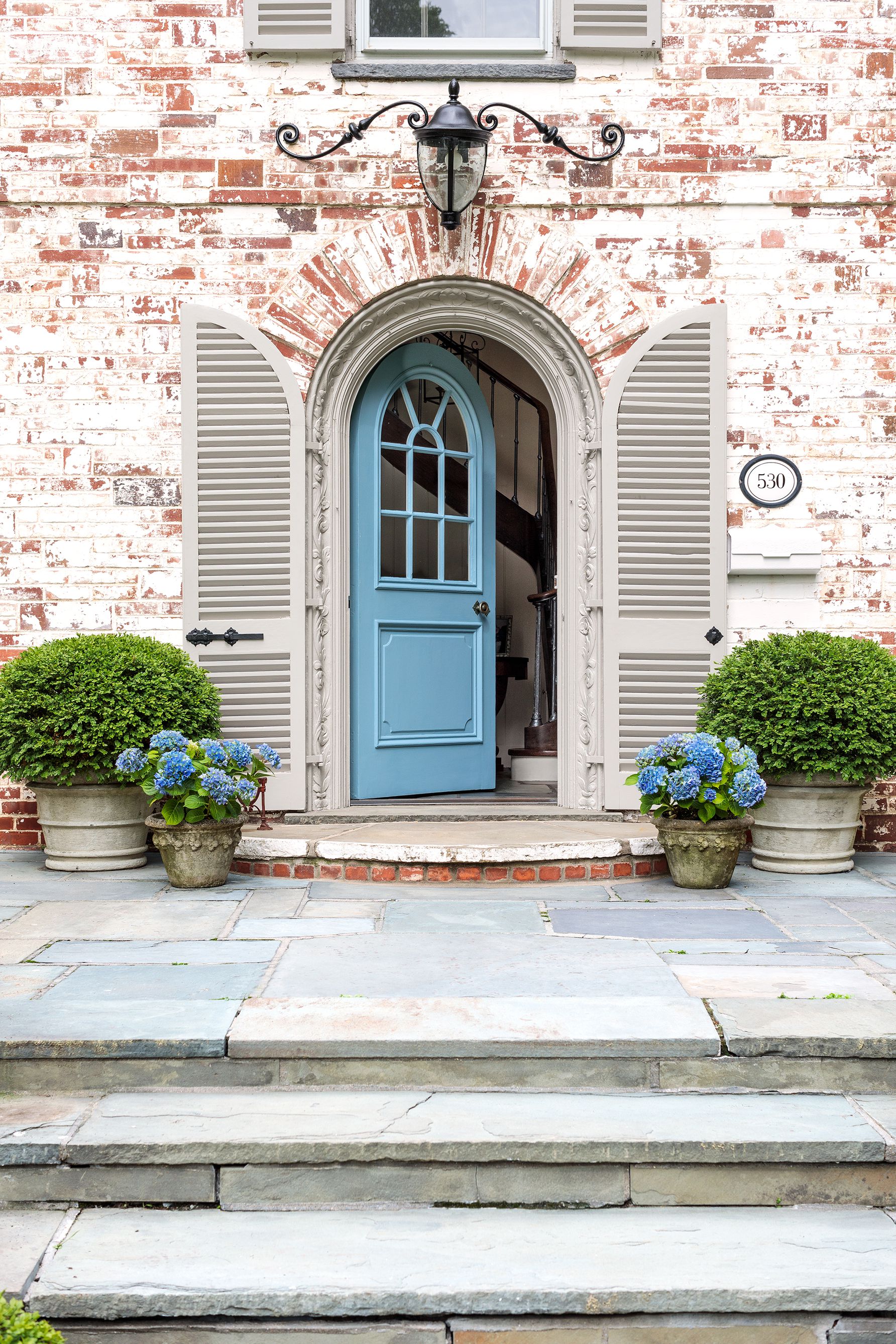
The arched doorway accented with a pristine mid-toned blue matches the potted flowers perfectly. This certainly makes for a fine provincial entrance.

Similar Color Regale Blue (SW6801) Sherwin Williams

Regale Blue SW6801_SherwinWilliams.png
Santorini

Santorini

Although it may be challenging to recreate this dreamy Greek Isle setting and the perfect coastal color scheme. This aegean blue color is painted into the architectural landscape there and can take any entry to another transcending level.

Similar Color St. Giles Blue (No.280) by Farrow & Ball

StGilesBlue No 280_Farrow&Ball.png
Luxe Interiors + Design  Photo: Karyn Millet

Luxe Interiors + Design Photo: Karyn Millet

A bright seafoam green color painted on this farmhouse barn door adorns the entrance of a contemporary stylish California beach house. An updated color blend which gives a home a light and bright vibe.

Similar Color Jocular Green (SW6736) Sherwin Williams

Jocular Green SW6736_SherwinWilliams.png

Color doesn’t have to be intimidating, it can be a fun journey to transform the way you and your guests feel entering your home. As an Interior Designer we service clients frequently that are interested in paint consultations. So grab some paint samples with us and take the exhilarating plunge into a life lived in color.

Cheers to Spring!

Melissa Mathe

*Contact mathedesign.com for all your Interior Design needs.

Wake Up Refreshed: Bedroom Design

Wake Up Refreshed: Bedroom Design

“ All you need is love… and a good design.” ~ Melissa Mathe

Bernhardt Furniture

Bernhardt Furniture

A well designed bedroom will allow you to get your best sleep… waking up refreshed and ready to take on the day. As a beloved sanctuary it deserves a fair share of attention to details to create a serene space. Thoughtful planning will provide not only a beautiful result but one that functions especially for you. In working with a designer it is helpful to talk about how you utilize your space. We’re sharing a few bedroom designs in this blog post to show how a design is pulled together for a client

Bernhardt Furniture

Bernhardt Furniture

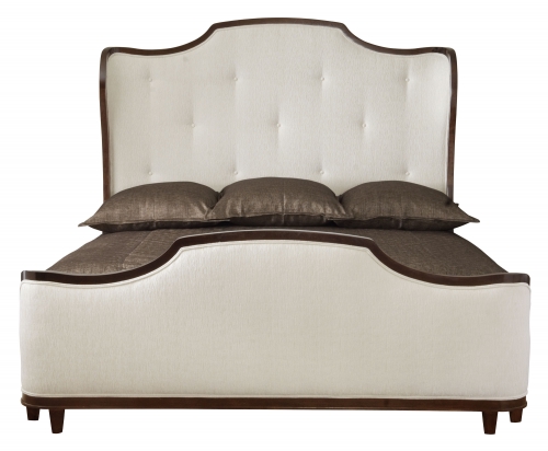
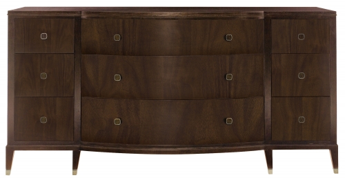
In the first spacious master bedroom design Bernhardt furniture was selected for it’s timeless silhouette and impeccable crafted quality. The upholstered panel bed draws your eye in with it’s bold curved lines. Combining with it a more traditional dresser and a contemporary nightstand gives the master a feeling of grand updated sophistication. While selecting paint the tray ceiling was chosen in a complimentary paint color to the walls so to accent the architectural details. Custom draperies made with additional trim detailing were fabricated for those added designer touches our clients love.

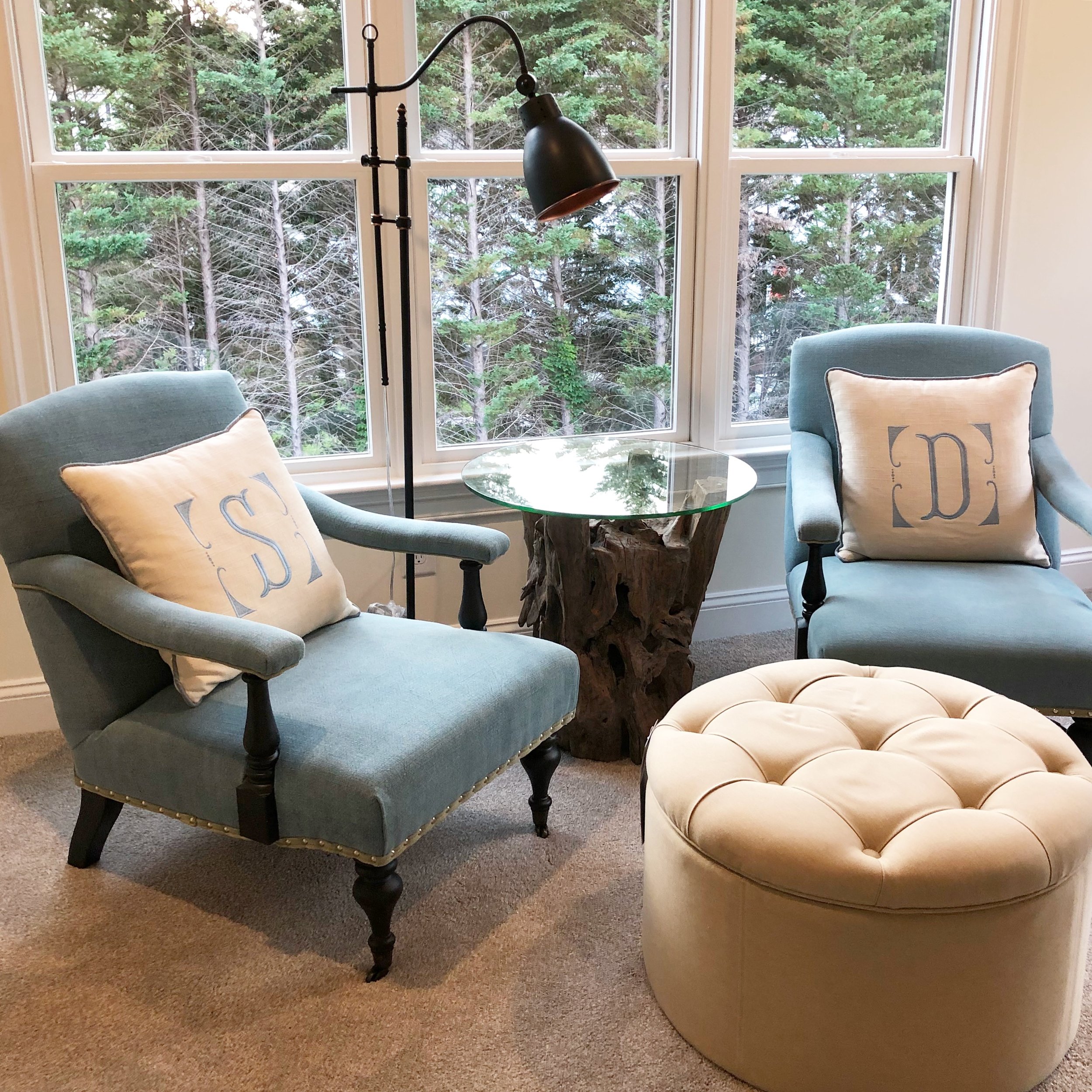
A quiet sitting space was created as a separate area where the couple can retreat to unwind reading or talk about the day. Unique furniture pieces and lighting fill this area and reflect our clients personal style. Personalized touches such as monogrammed pillows give attention to special details that make a room feel more intimate.

We’ve included resources to share for the sourced furniture and fixtures selected on this residential project.

A second bedroom design is pulled together with an adapted theme to it in a subtle way. This particular residential project is located in a warm climate where the sky and sunset were drawn from as inspiration. The cool blue tones paired with warmer coral toned colors create the sense of sunny skies and soaring temperatures all around.

Crane & Canopy

Crane & Canopy

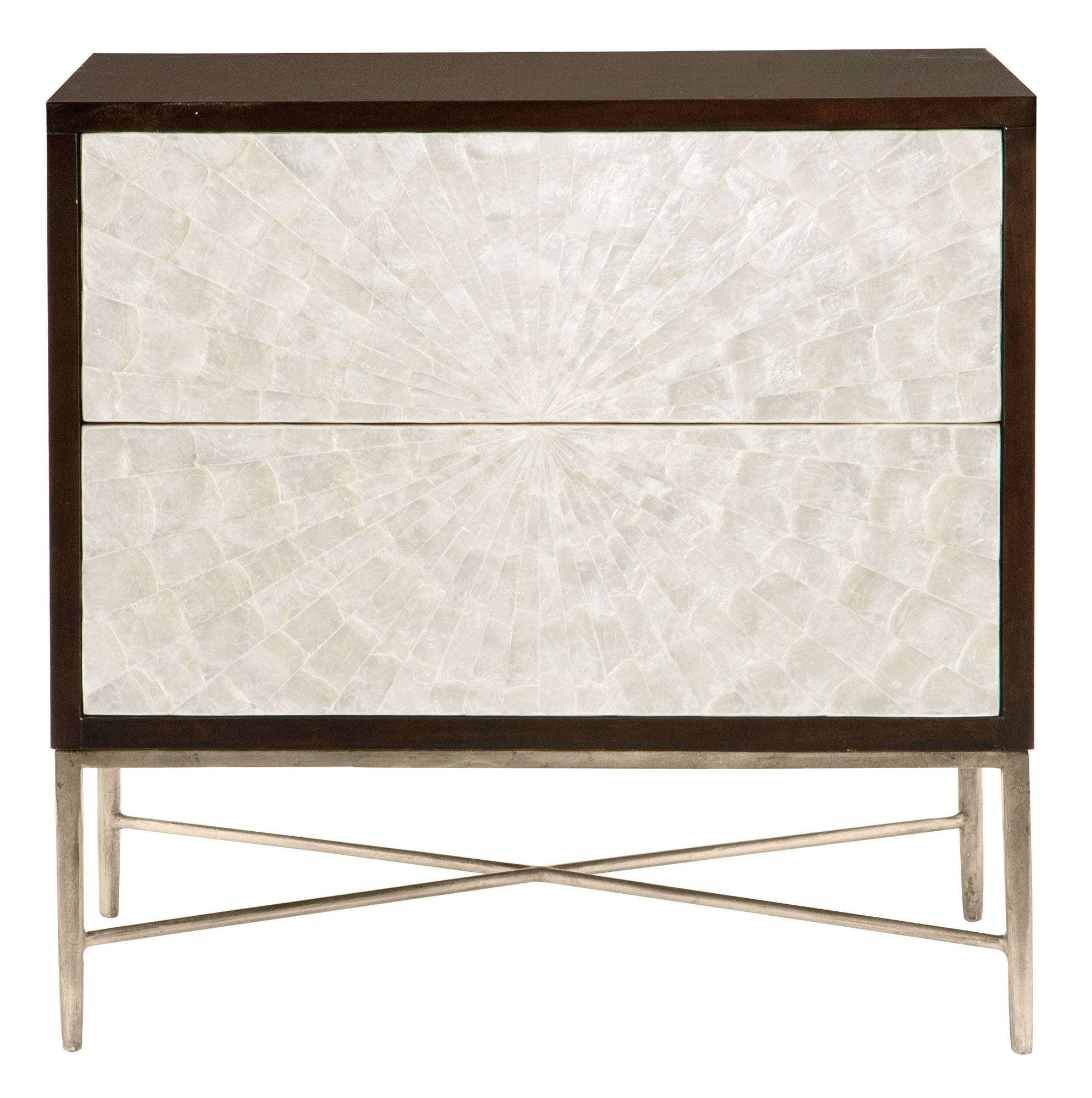
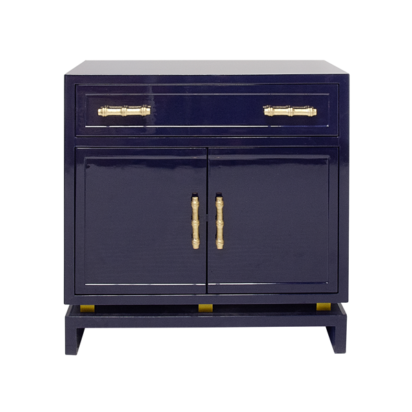
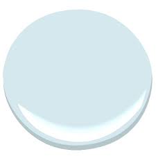
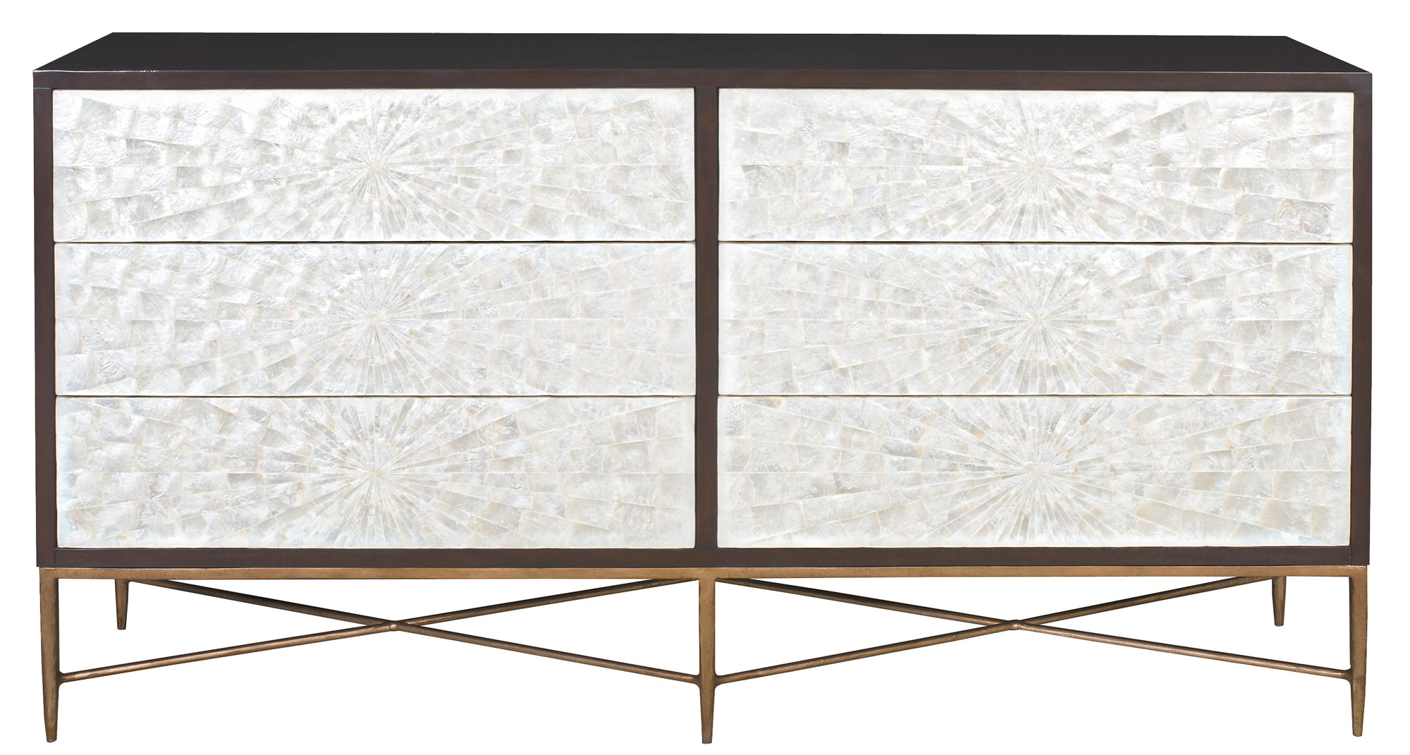
Soft blue walls painted in Benjamin Moore color Harbor Fog bring in the sky inspiration as a backdrop. The design board shows a custom covered upholstered headboard and bedding in a complimenting color palette. For additional interest the dresser selected has capiz shell covered drawer fronts to lend a nod to shell fish from the ocean. Flanking the headboard are two high gloss lacquered navy blue night stands with brass bamboo pulls for that added designer sophistication.

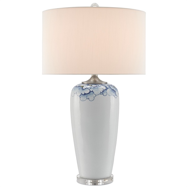
More resources to share with you here for sourced furniture and fixtures selected on this residential project.

Having a bedroom that is designed in a style all your own will help you to related to your space and feel comfortable in it from day-to-day… especially in moments of much needed unwinding.

Cheers!

Melissa Mathe

*Contact mathedesign.com for specialty pricing and all your Interior Design needs.

The Whole Nine Yards In Mink

the whole nine yards in mink

"Simplicity is the ultimate form of sophistication" ~ Leonardo da Vinci

Bernhardt Furniture Company

Bernhardt Furniture Company

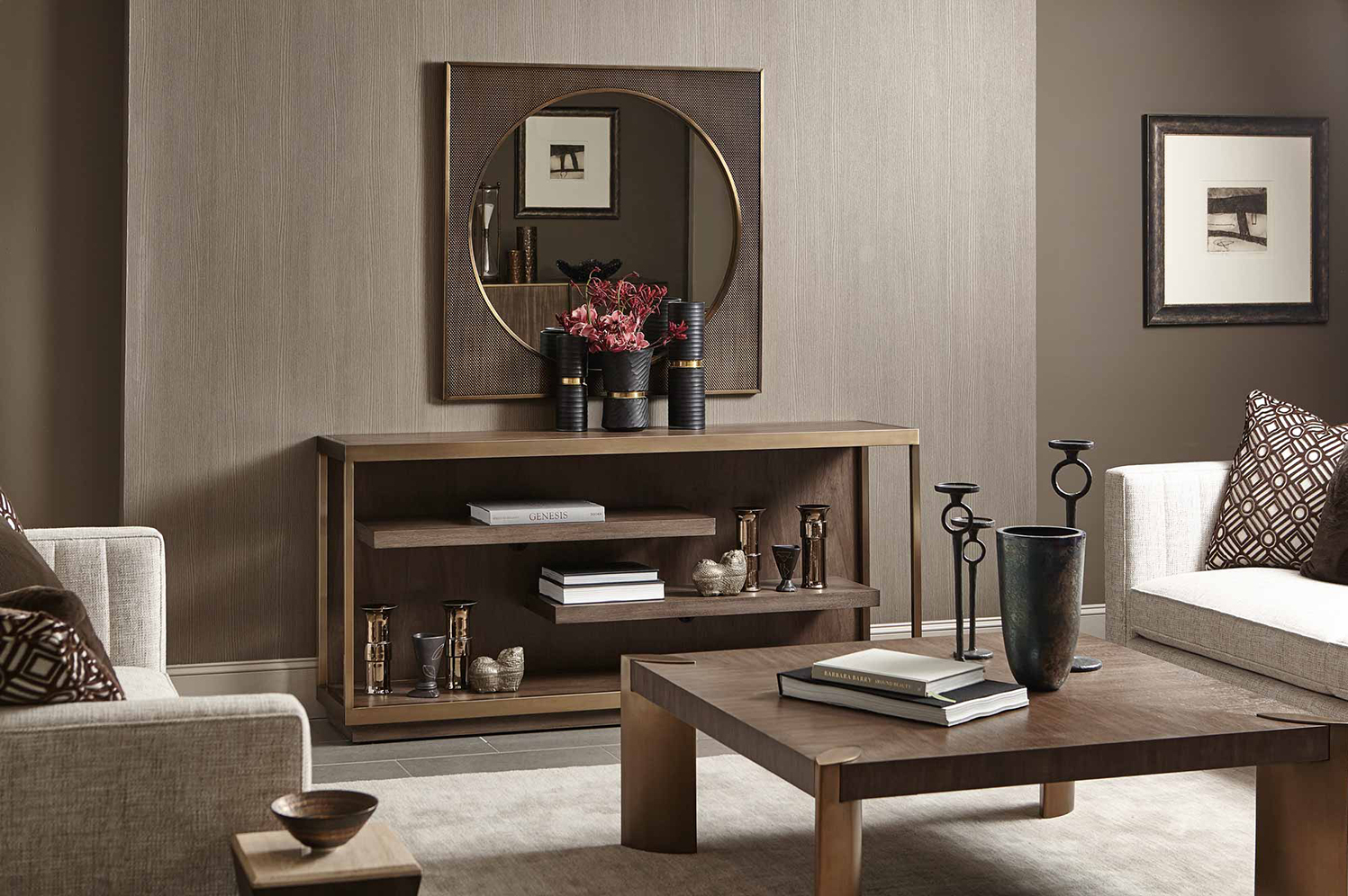
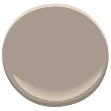
As our economy continues to slowly rise, we see color trends warming up.  Grey will still be around, but you will see the use of warm grey and "greige" (the term given to a grey/beige color). Enter: Mink.

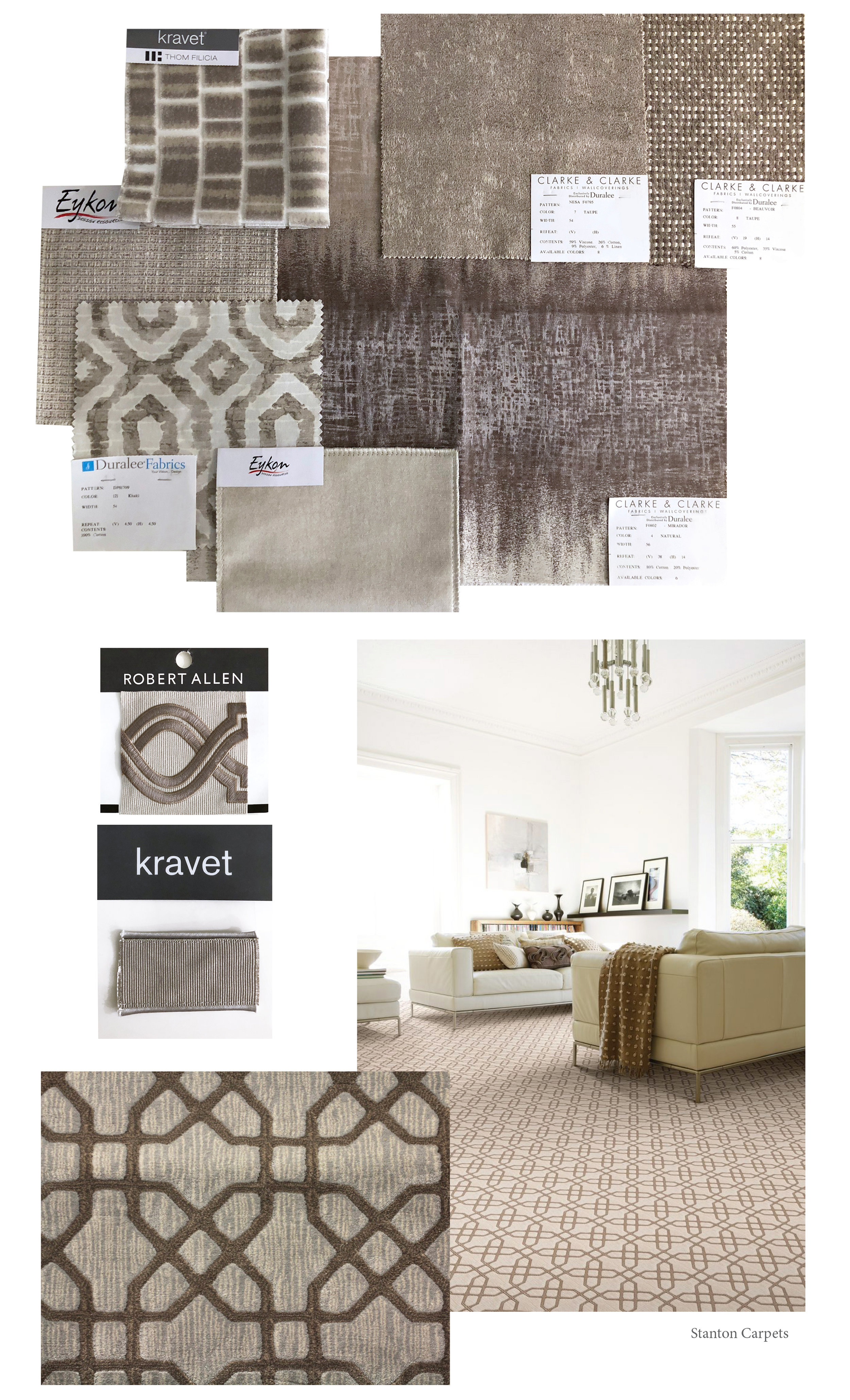
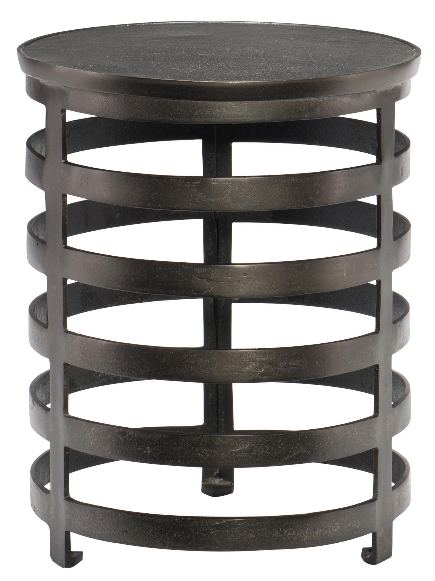
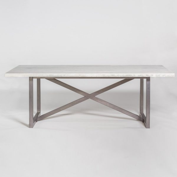
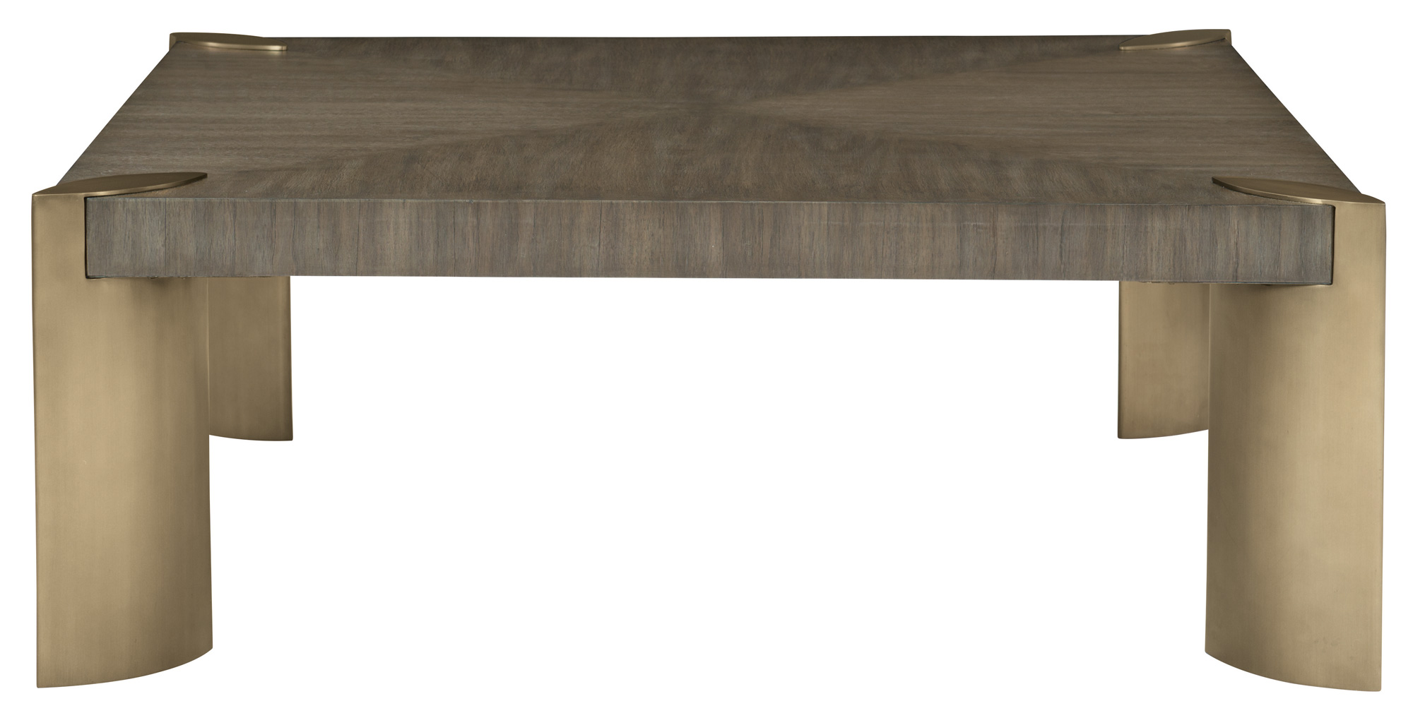
Dreamy neutral interior spaces can transport the aesthetic to an elegant and luxe state.  While subtle accent colors, pattern, and texture play a supporting role in bringing added interest.  We have our eyes on a color we affectionately call "Mink"... doesn't it just sound pretty.  Well, we're pretty excited about adding this decadent color into design schemes to create that neutral clean contemporary feel.  Mink is a rich color that is confident and warm. Using soft creamy colors to provide a serene base and layering in this deep color provides  a sense of grounding to the overall interior style.  This color can be found in all interior furnishings: fabrics, wood tones, tile, and stone.

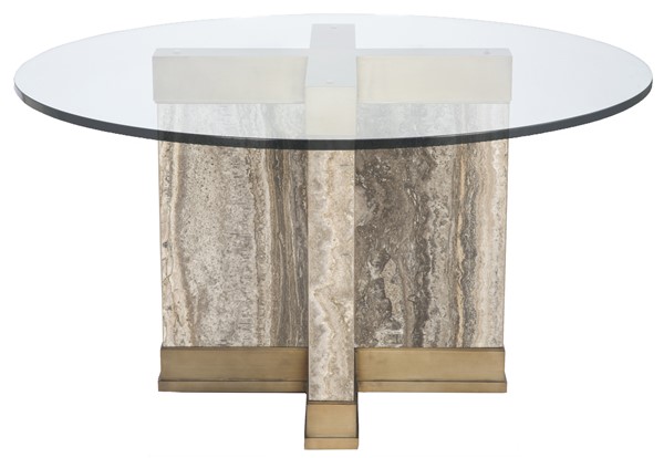
As you can see these fabric selections, trim and carpet are lovely examples that can easily be pulled in - to compliment.  As we've recently sourced furniture and lighting for this aesthetic we have an assortment to share along with a to-die-fo…

Here are details on neutral furniture and fixtures for your resource. Plus a to-die-for paint color to tie everything together.

We hope you enjoy our new color crush discovery and also hearing more about this luxe style.  We wouldn't hold it against anyone to casually use this color for there next professional manicure either... because we've done it ourselves.

Cheers!

Melissa Mathe

*Contact mathedesign.com for specialty pricing, non-priced items and other Interior Design needs.

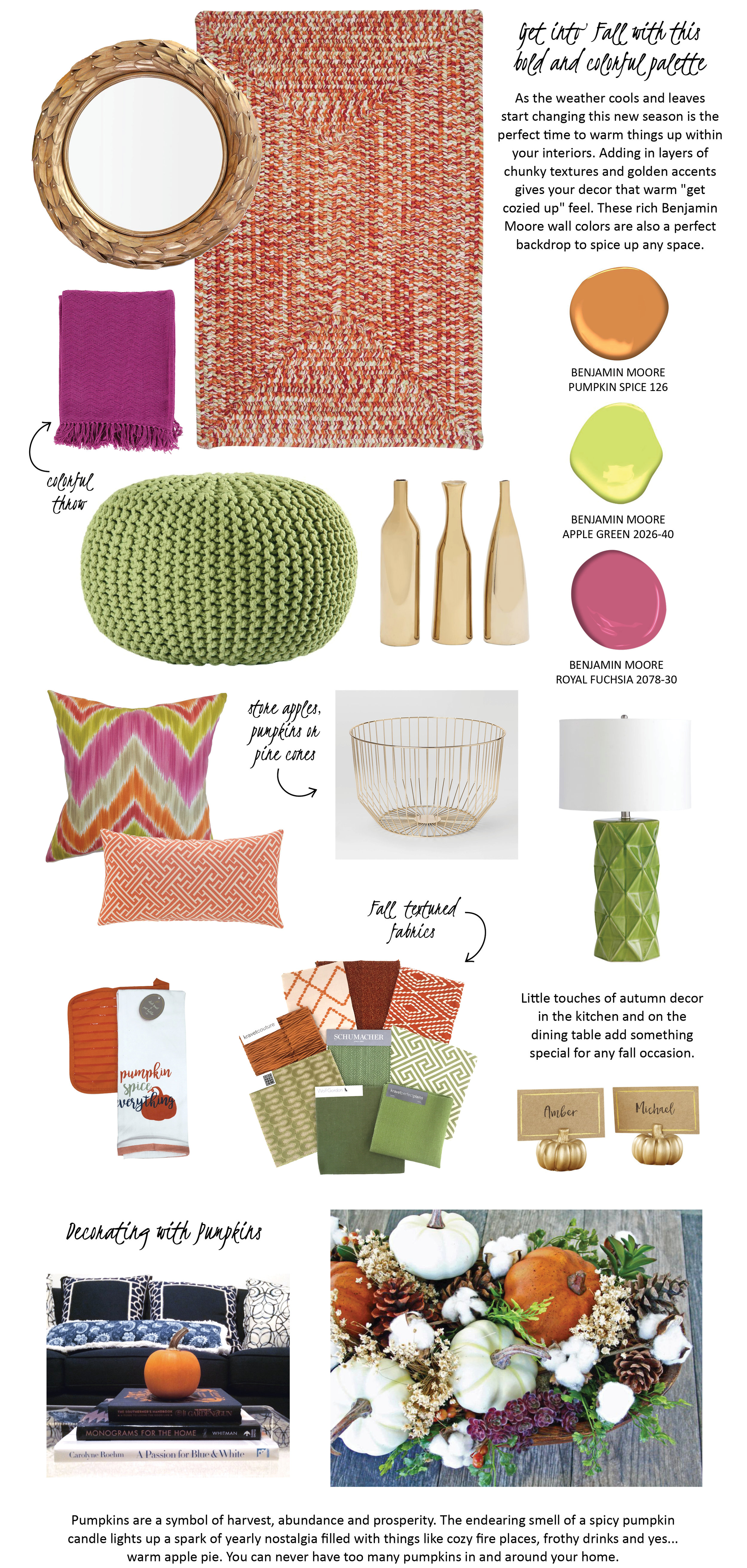
Pumpkin Spice Up Your Space

PUMPKIN SPICE UP YOUR SPACE

"Life starts all over again when it gets crisp in the fall." ~ F. Scott Fitzgerald

For information on the items shown above click on these links: athena laurel leaf mirror, chunky rug, colorful throw, knit pouf, gold vases, colorful zig zag pillow, greek key lumbar pillow, gold wire basket, lamp, dish towel and potholder, place card pumpkins

Happy Fall, Ya'll!

Melissa Mathe

*Contact mathedesign.com for specialty pricing on non-priced item links

Contact us for all your Interior Design and Decorating needs @mathedesign.com
 

Your Ceiling: The Fifth Wall

YOUR CEILING: THE FIFTH WALL

"Look up to the sky. You'll never find rainbows if you're looking down." ~ Charlie Chaplin

Melissa Mathe Interior Design - Ansel Olsen Photography

Melissa Mathe Interior Design - Ansel Olsen Photography

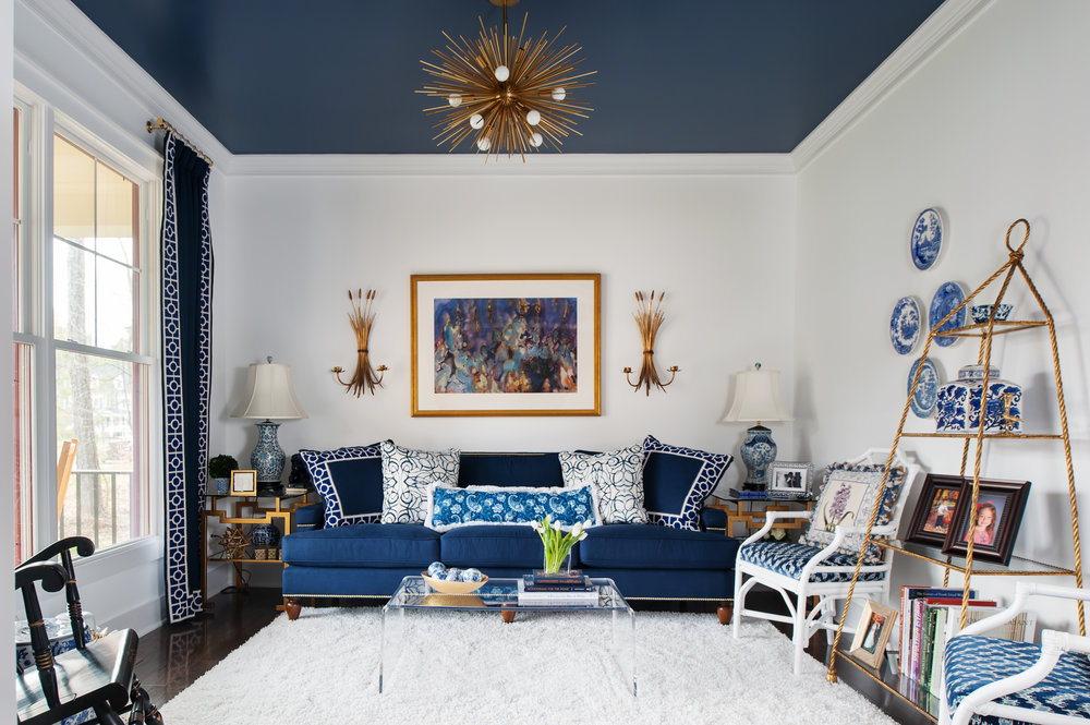
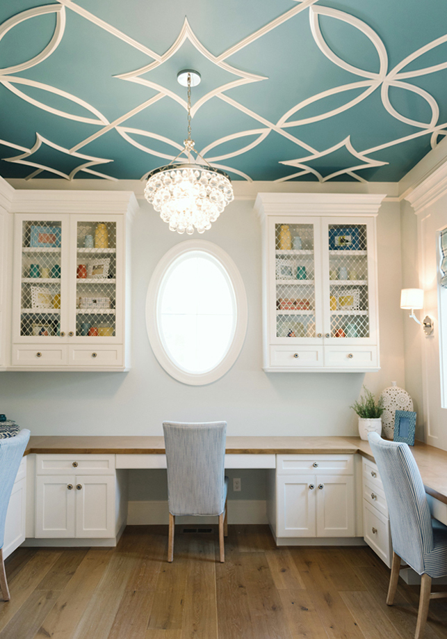
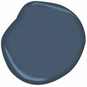
When meeting with my clients, I like to let them know they have a "Fifth Wall" option to create the unexpected in a room. Whether it's a bold or a subtle contrast the design treatment of painting your ceiling adds a special touch of excitement and elegance in any space. Often times the ceiling is overlooked in the design. In some rooms a traditional white ceiling is just the right color. However, it is important to keep this fifth wall in mind while developing the design of a space. For example a boldly painted Van Deusen Blue by Benjamin Moore color creates a stunning backdrop for this golden chandelier.

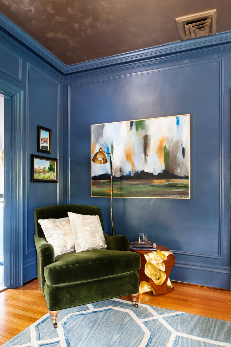
Here are more examples of painted ceilings we can't get enough of.

Melissa Mathe Interior Design for Richmond Symphony Orchestra League Designer House 2016 - Ansel Olsen Photography

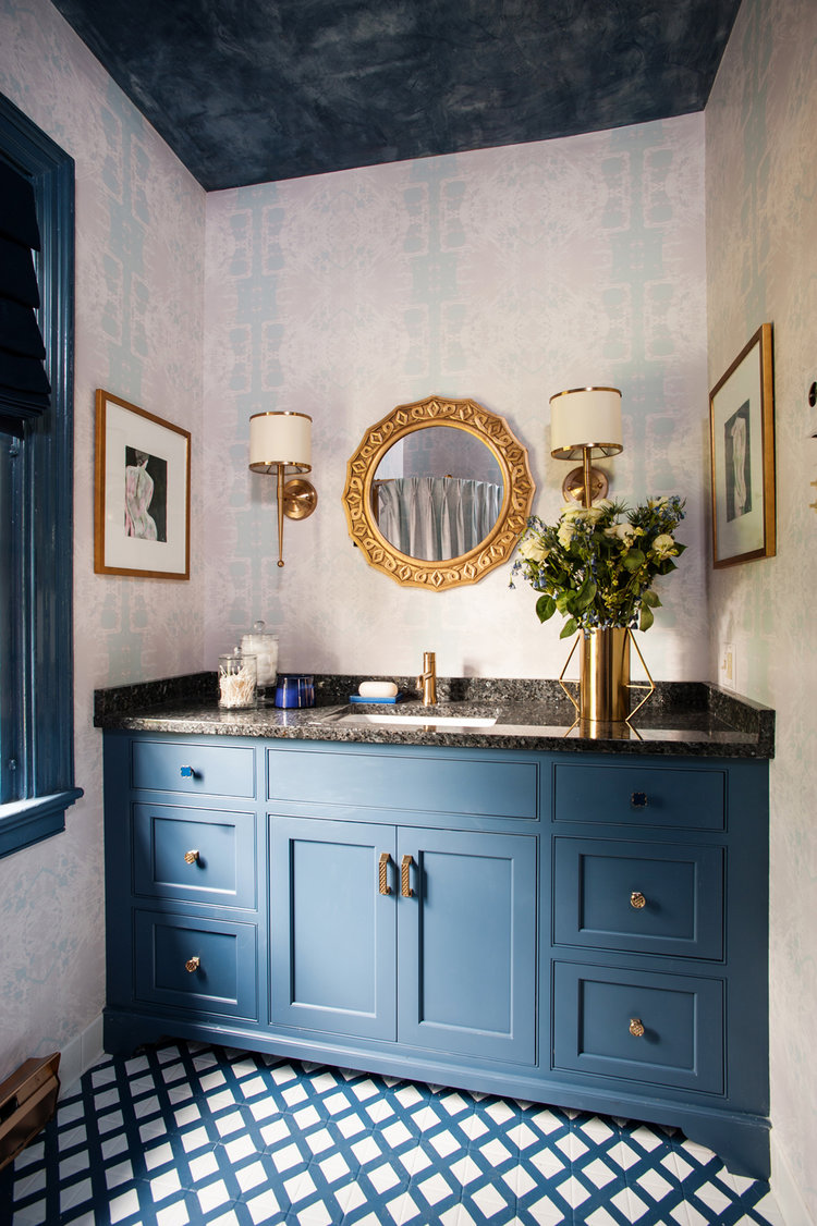
The Wolf Gordon - Scuffmaster Environmental Brush, Color EM729B adds a gilded luminous, metallic luster that other paints can't match along with ultimate durability. The metallic ceiling allows the light to reflect back down into the space. The texturizing of this Van Deusen Blue Benjamin Moore painted bathroom ceiling creates an artistic element that melds seamlessly with the patterns of the rooms wallpaper and floor tile.
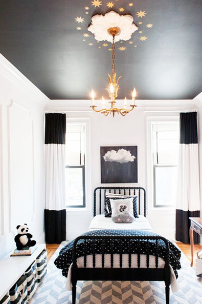
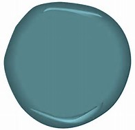
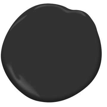
For an intense drama add deeper colors like the Baltic Sea Benjamin Moore teal blue in this Lindy Allen designed room photographed by Jessie Alexis and Black Benjamin Moore paint that can be used for a black and white room such as this sophisticated design by Brooklyn Limestone.
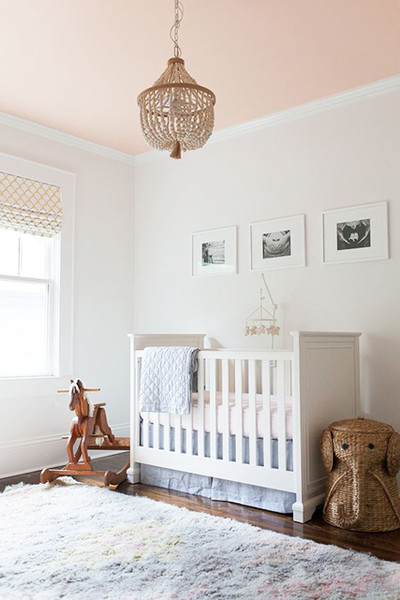
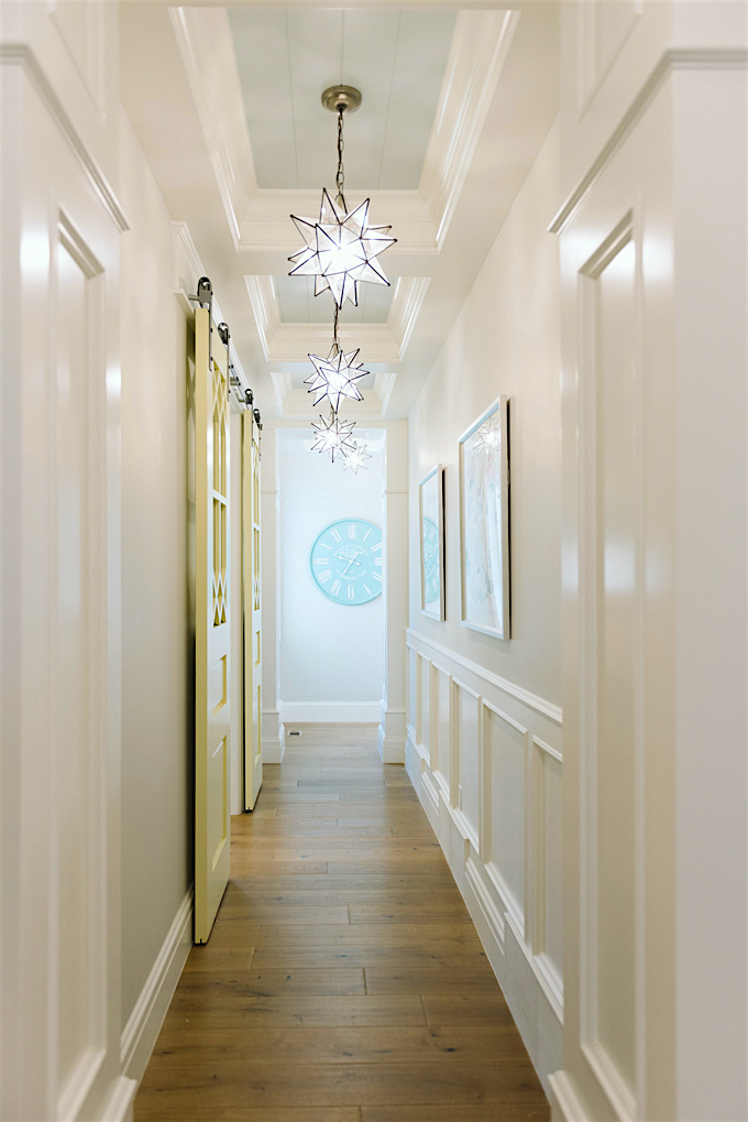
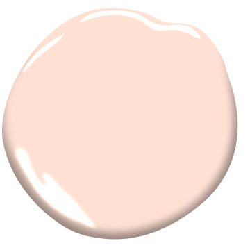
Just in case you may not feel up to taking a bold plunge we've found a few lighter applications. The peachy painted ceiling in this nursery from 1oo Layer Cakelet is a fresh splash of color for any one to wake up to. Their client created a custom mixed color however a good alternative we've found is Peach Cloud from Benjamin Moore. Another example of this is by bringing to life a narrow hallway with a soothing color like Cool Breeze from Benjamin Moore creating a dreamlike transition from room-to-room - Lindy Allen designed photographed by Jessie Alexis.

Melissa Mathe Interior Design

Melissa Mathe Interior Design

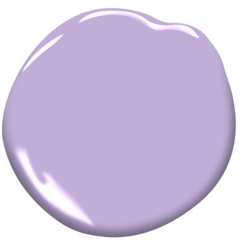
This teen room from a client of ours has a pretty color popped Amethyst Cream Benjamin Moore painted ceiling that is the icing on the cake against the Chantilly Lace Benjamin Moore white walls.

The possibilities are endless when you imagine new ways to create magic in your home by painting this "Fifth Wall".

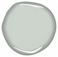
Here are some examples of Benjamin Moore colors listed above:

Share your painted ceiling with #fifthwalldesign and we'll share our top pick.

Never underestimate the power of paint and a great design!

Melissa Mathe

Contact us for all your Interior Design and Decorating needs @mathedesign.com