Spotlight On Commercial Design: The Bar Method Richmond

spotlight on commercial design:
the bar method richmond

"Keep your heels, head and standards high." ~ Coco Chanel

Bar Method Wall_Counter.jpg

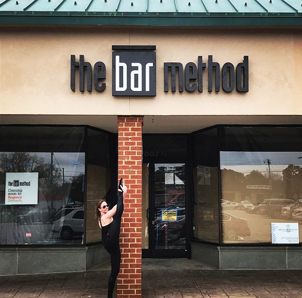
This past May of 2017, The Bar Method of Richmond opened it's doors to welcome barre babes to get fit while tucking and shaking in their new studios.  We couldn't have been more excited to jump at the opportunity to be a part of this Commercial Design project.  While working with the owner, Nicole Davis, we developed a bold and chic design that both met the owner's personal style and also met the requirements within the national brand.  The dramatic entrance of the lobby area is anchored with rich dark floors, a bold striped feature wall behind the welcome counter and lit to perfection overhead with an over-sized black chandelier.  A stylish way to start a workout any day of the week in our book.

Located on the Three Chopt Road in the Village Shopping Center, near the University of Richmond - conveniently situated between Carytown and Patterson Avenue.  This is a great location to get to from any part of the local Richmond Virginia area.  In working to design a commercial space there are several key players that come together to make a project like this come to life.  In this case the owner, commercial general contractor and his team, along with us at Melissa Mathe Interior Design worked together to keep the project scope and opening date in focus.

The lobby space is complete with a sophisticated seating area for clients to relax before and after classes.  Featuring a tufted sofa, glam end tables, acrylic chairs and chic graphic elements on both the throw pillows and rug.  Attendees are welcome to grab a cup of water or coffee and shop the retail boutique section filled with barre merchandise professionally displayed.  All the activewear, water bottles and totes a fitness goer can utilize... situated on racks, shelving and mannequins displayed in the front window.  Seeing the dream of this commercial space for the owner, Nicole Davis and the instructors come to fruition is quite a thrilling and rewarding experience for us. We appreciate hearing positive feedback and were pleasantly surprised to  read this response from one of The Bar Method clients on their social media.

spacegraphic2-01.png

"Stopped by the @barmethod_richmond this morning. Such a pretty studio and a cute boutique in the front!
Oh yes, and a definitely solid workout." ~ Megan Marconyak

Bar Method Studio.jpg

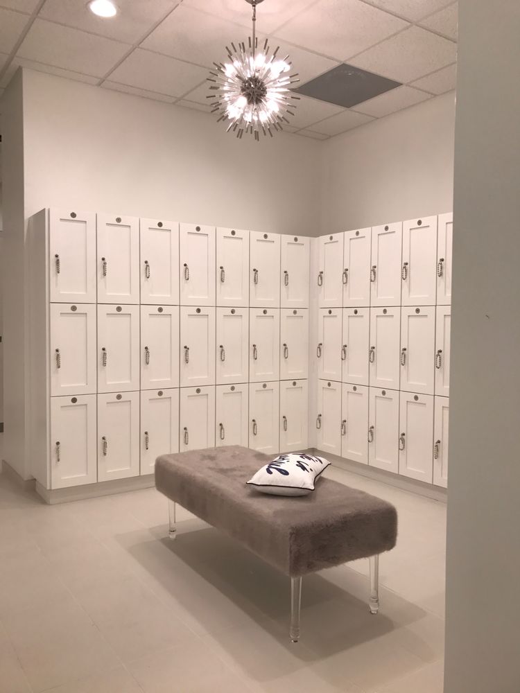
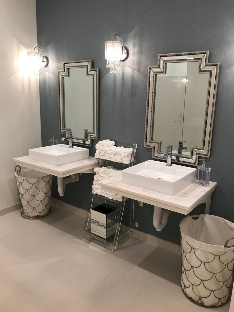
The palette in the studios is minimalistic and clean to create a sense of balance and not detract from all those raised heels and concentrated long holds going on during class. Special added touches in the locker-changing area and bathroom were installed with modern lighting and sparkling wall covering.  Set to give everyone a little feeling of pampering while getting a workout in at the start or end of their day.

We hope you enjoy seeing this commercial design space as much as we have being a part of it!

To learn more about The Barre Method studios, owner and instructor Nicole Davis and why this workout is so special check them out here.

Cheers!

Melissa Mathe

*For all your Commercial Interior Design needs contact mathedesign.com

Pumpkin Spice Up Your Space

PUMPKIN SPICE UP YOUR SPACE

"Life starts all over again when it gets crisp in the fall." ~ F. Scott Fitzgerald

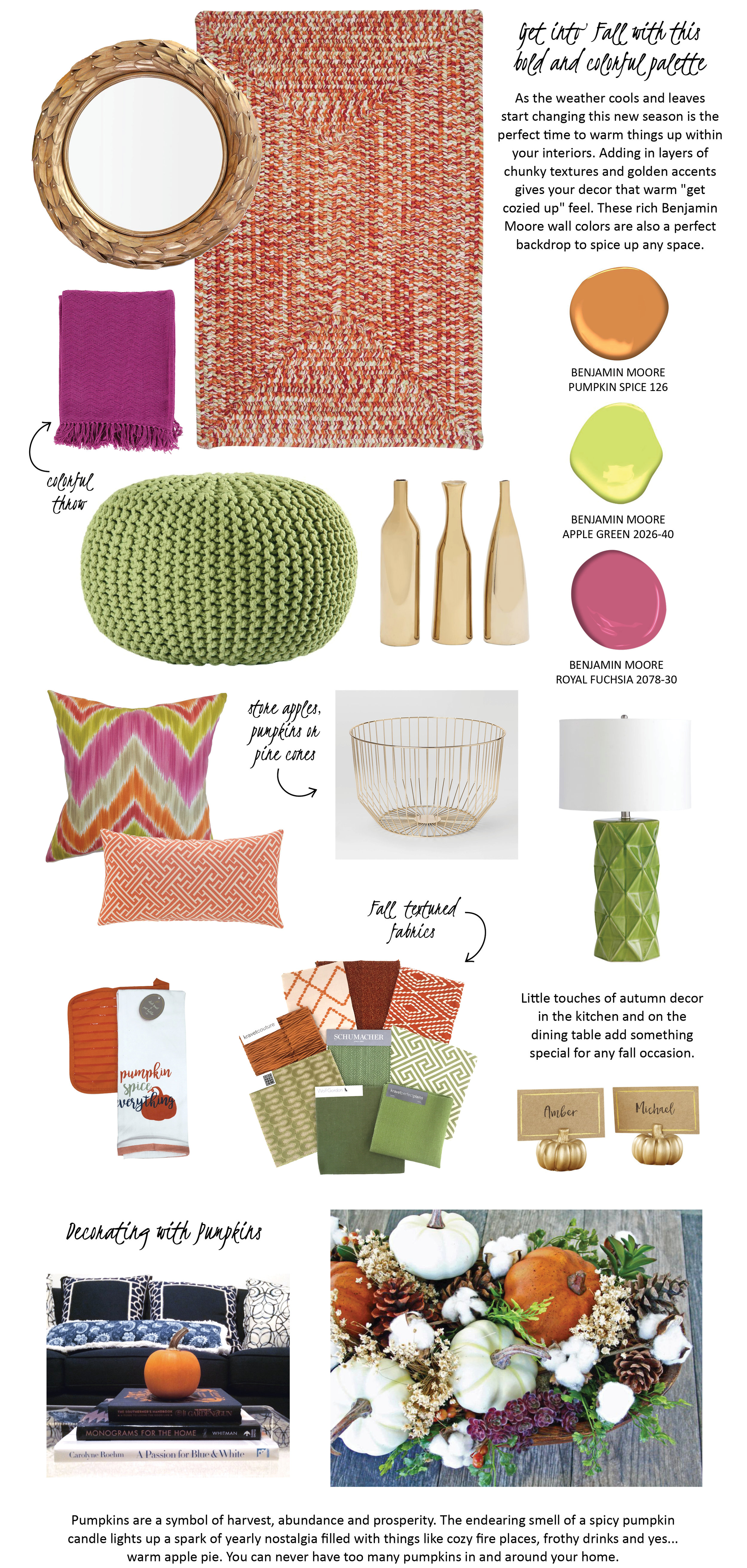
For information on the items shown above click on these links: athena laurel leaf mirror, chunky rug, colorful throw, knit pouf, gold vases, colorful zig zag pillow, greek key lumbar pillow, gold wire basket, lamp, dish towel and potholder, place card pumpkins

Happy Fall, Ya'll!

Melissa Mathe

*Contact mathedesign.com for specialty pricing on non-priced item links
Contact us for all your Interior Design and Decorating needs @mathedesign.com
 

Your Ceiling: The Fifth Wall

YOUR CEILING: THE FIFTH WALL

"Look up to the sky. You'll never find rainbows if you're looking down." ~ Charlie Chaplin

Melissa Mathe Interior Design - Ansel Olsen Photography

Melissa Mathe Interior Design - Ansel Olsen Photography

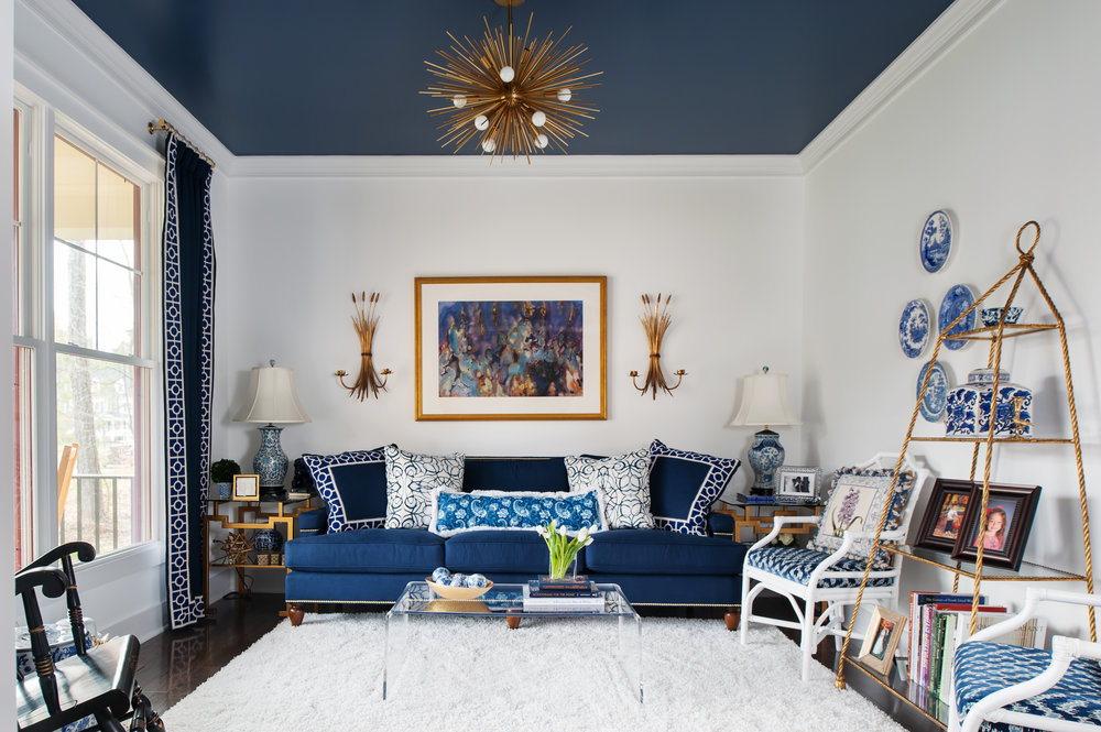
When meeting with my clients, I like to let them know they have a "Fifth Wall" option to create the unexpected in a room. Whether it's a bold or a subtle contrast the design treatment of painting your ceiling adds a special touch of excitement and elegance in any space. Often times the ceiling is overlooked in the design. In some rooms a traditional white ceiling is just the right color. However, it is important to keep this fifth wall in mind while developing the design of a space. For example a boldly painted Van Deusen Blue by Benjamin Moore color creates a stunning backdrop for this golden chandelier.

Here are more examples of painted ceilings we can't get enough of.

Melissa Mathe Interior Design for Richmond Symphony Orchestra League Designer House 2016 - Ansel Olsen Photography

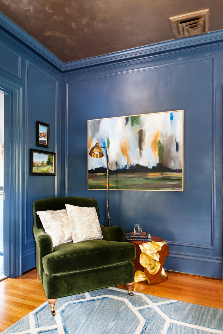
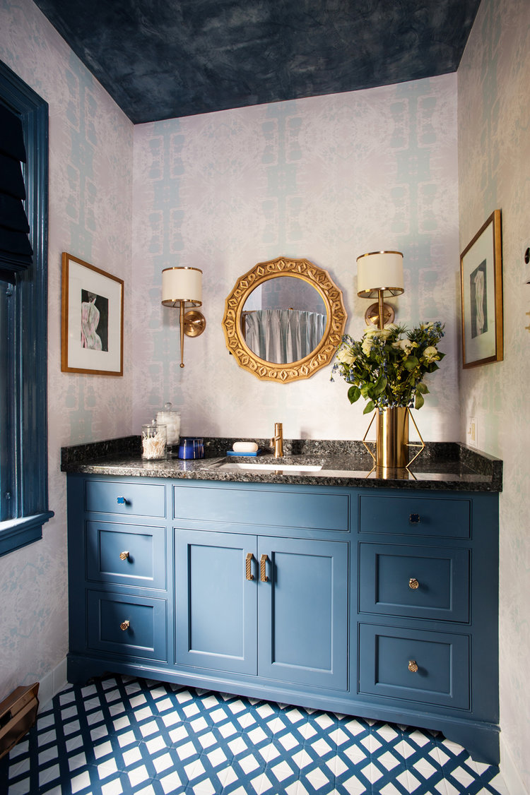
The Wolf Gordon - Scuffmaster Environmental Brush, Color EM729B adds a gilded luminous, metallic luster that other paints can't match along with ultimate durability. The metallic ceiling allows the light to reflect back down into the space. The texturizing of this Van Deusen Blue Benjamin Moore painted bathroom ceiling creates an artistic element that melds seamlessly with the patterns of the rooms wallpaper and floor tile.

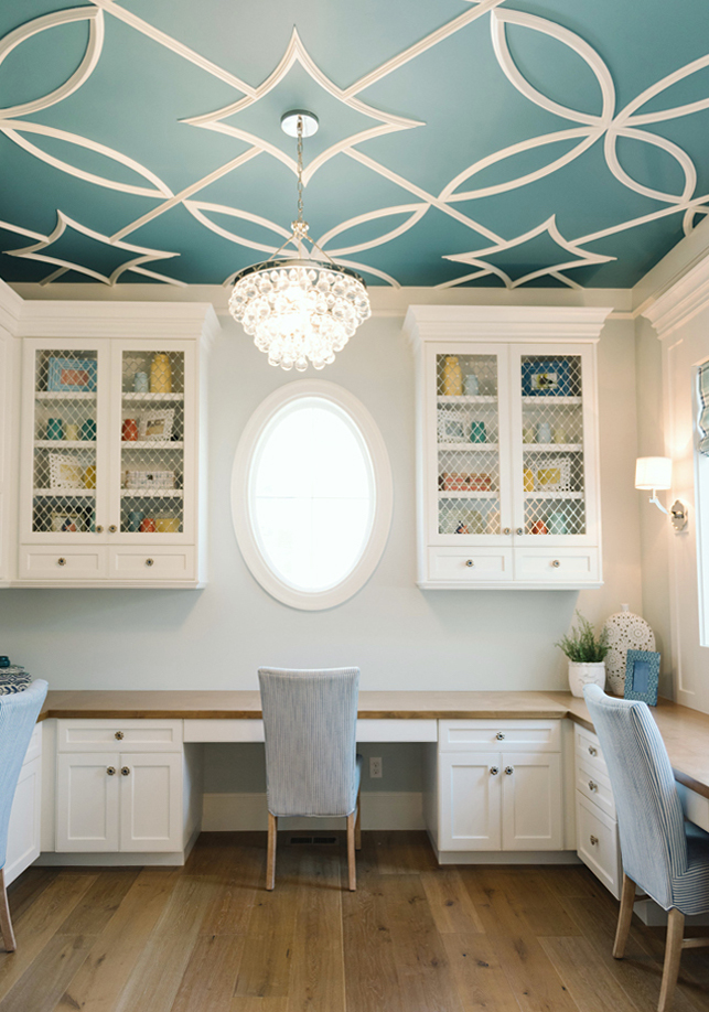
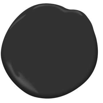
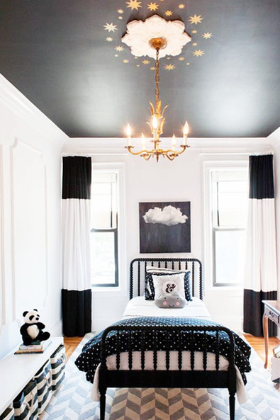
For an intense drama add deeper colors like the Baltic Sea Benjamin Moore teal blue in this Lindy Allen designed room photographed by Jessie Alexis and Black Benjamin Moore paint that can be used for a black and white room such as this sophisticated design by Brooklyn Limestone.

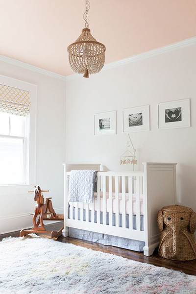
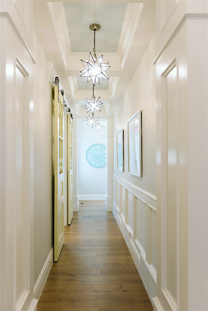
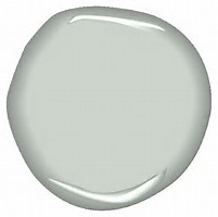
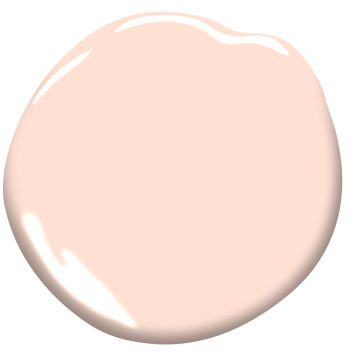
Just in case you may not feel up to taking a bold plunge we've found a few lighter applications. The peachy painted ceiling in this nursery from 1oo Layer Cakelet is a fresh splash of color for any one to wake up to. Their client created a custom mixed color however a good alternative we've found is Peach Cloud from Benjamin Moore. Another example of this is by bringing to life a narrow hallway with a soothing color like Cool Breeze from Benjamin Moore creating a dreamlike transition from room-to-room - Lindy Allen designed photographed by Jessie Alexis.

Melissa Mathe Interior Design

Melissa Mathe Interior Design

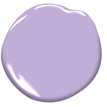
This teen room from a client of ours has a pretty color popped Amethyst Cream Benjamin Moore painted ceiling that is the icing on the cake against the Chantilly Lace Benjamin Moore white walls.

The possibilities are endless when you imagine new ways to create magic in your home by painting this "Fifth Wall".

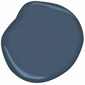
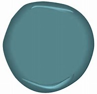
Here are some examples of Benjamin Moore colors listed above:

Share your painted ceiling with #fifthwalldesign and we'll share our top pick.

Never underestimate the power of paint and a great design!

Melissa Mathe

Contact us for all your Interior Design and Decorating needs @mathedesign.com