College Dorm Reveal: A Classic Contemporary Design

College Dorm Reveal: A Classic Contemporary Design

“ Some girls were just born with glitter in their veins.”


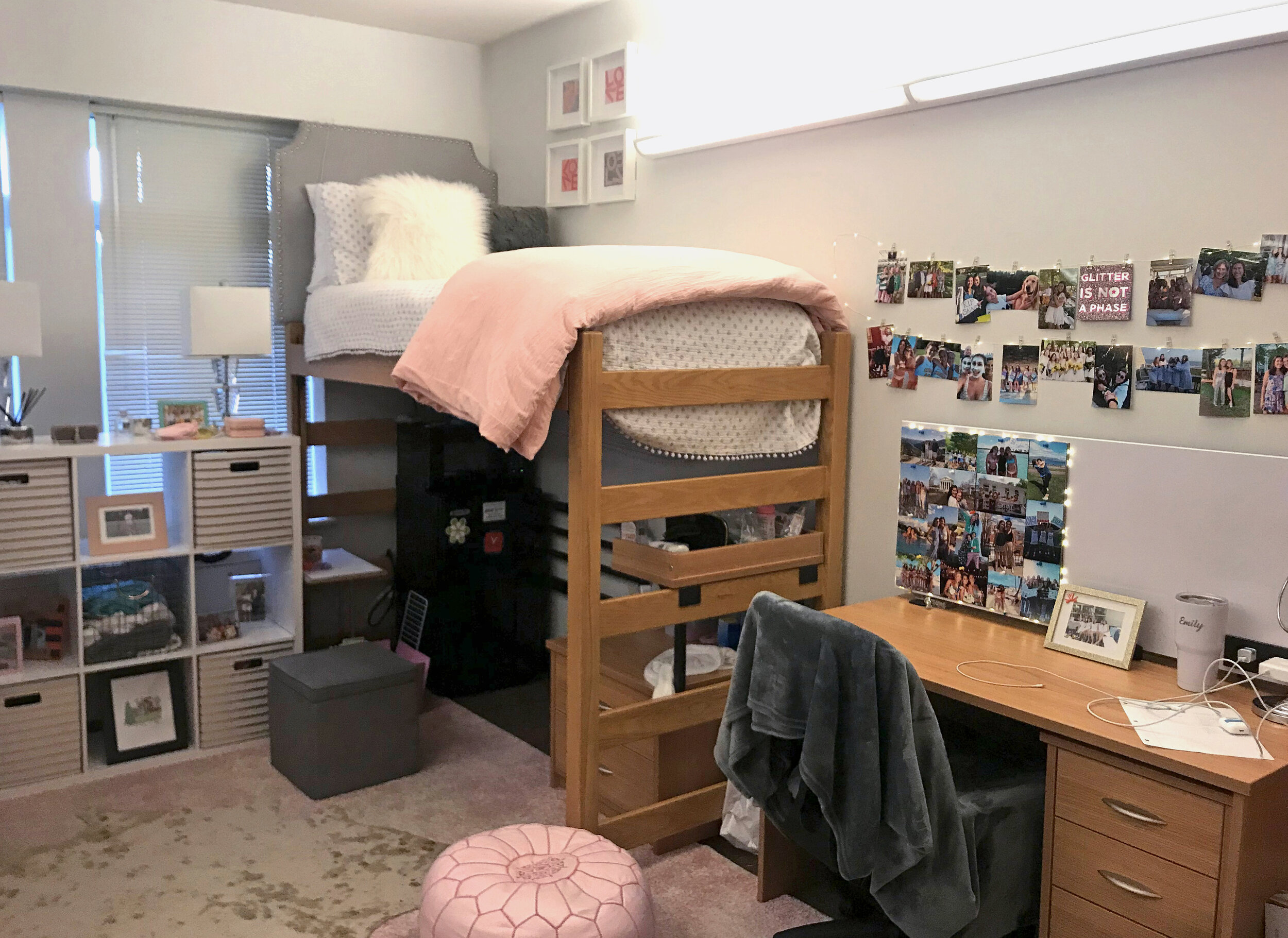
Creating a stylish college dorm design scheme doesn’t have to break the bank, especially when using basic dorm essentials from retailers and hiring a designer to pull it all together. In just a few weeks and a bit of online shopping… options were sourced and decisions could be made in time to install before the start of school. This recent dorm design won the Dorm Decorating Competition at UVA!


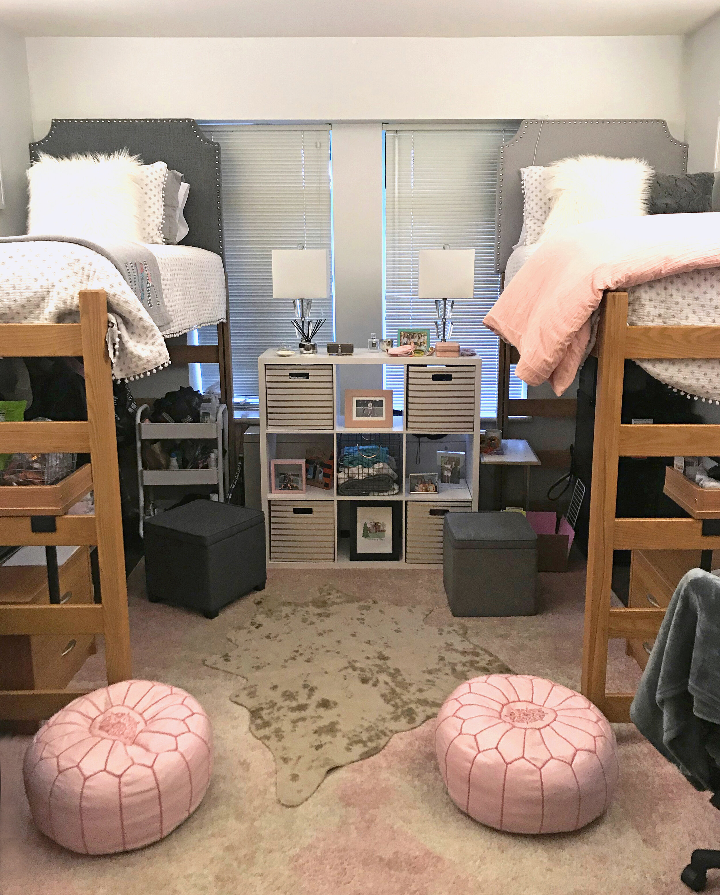
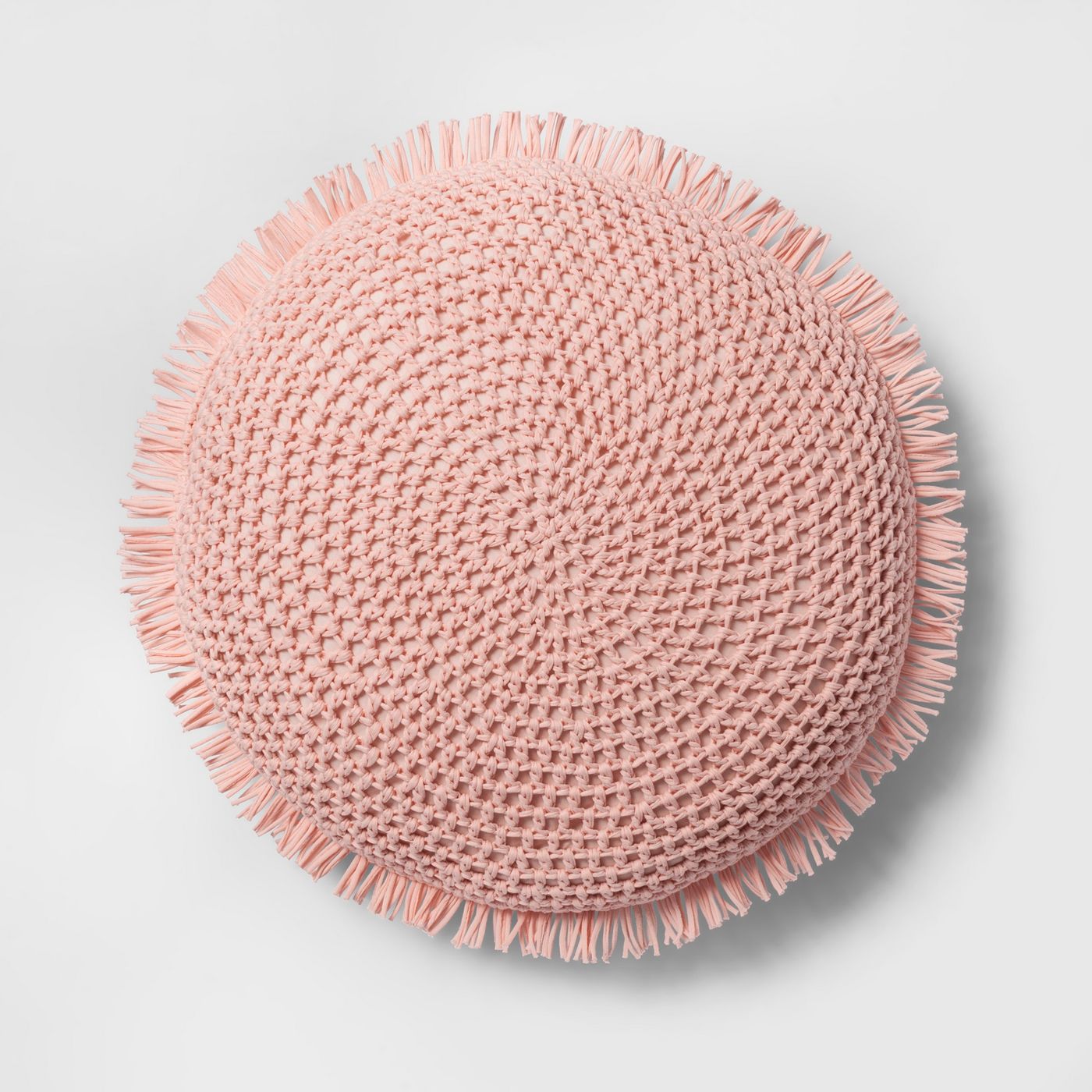
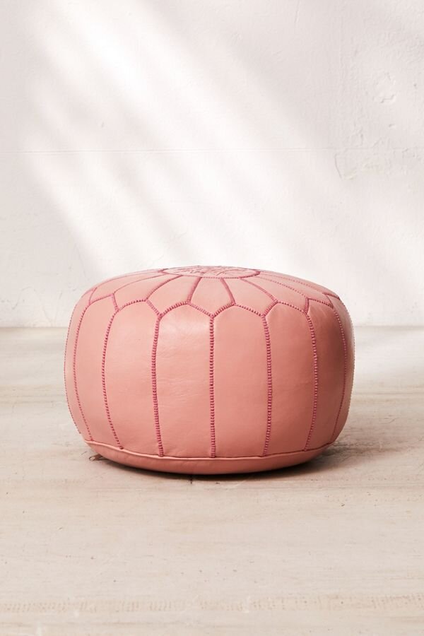
By adding elements of contemporary style with acrylic base lamps and layering these rugs. You can see how these added touches make this dorm room sparkle. The headboards and bedding have a more sophisticated look to bring in a little bit of chic and yes the rose pink leather moroccan poufs are like icing on the cake.

EmDorm4.jpg


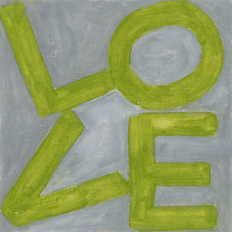
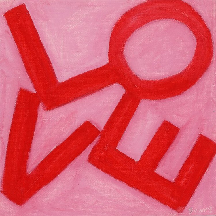
We love to infuse local artist work into our clients spaces and this client happens to love Sunny Stack Goode artwork. A perfect way to personalize and inspire creativity while studying or hanging out. The client’s mother found these Lovesquare prints which blended into the design perfectly and gave that special touch from Mom.

LOVESQUARE PRINTS


dorm room essentials

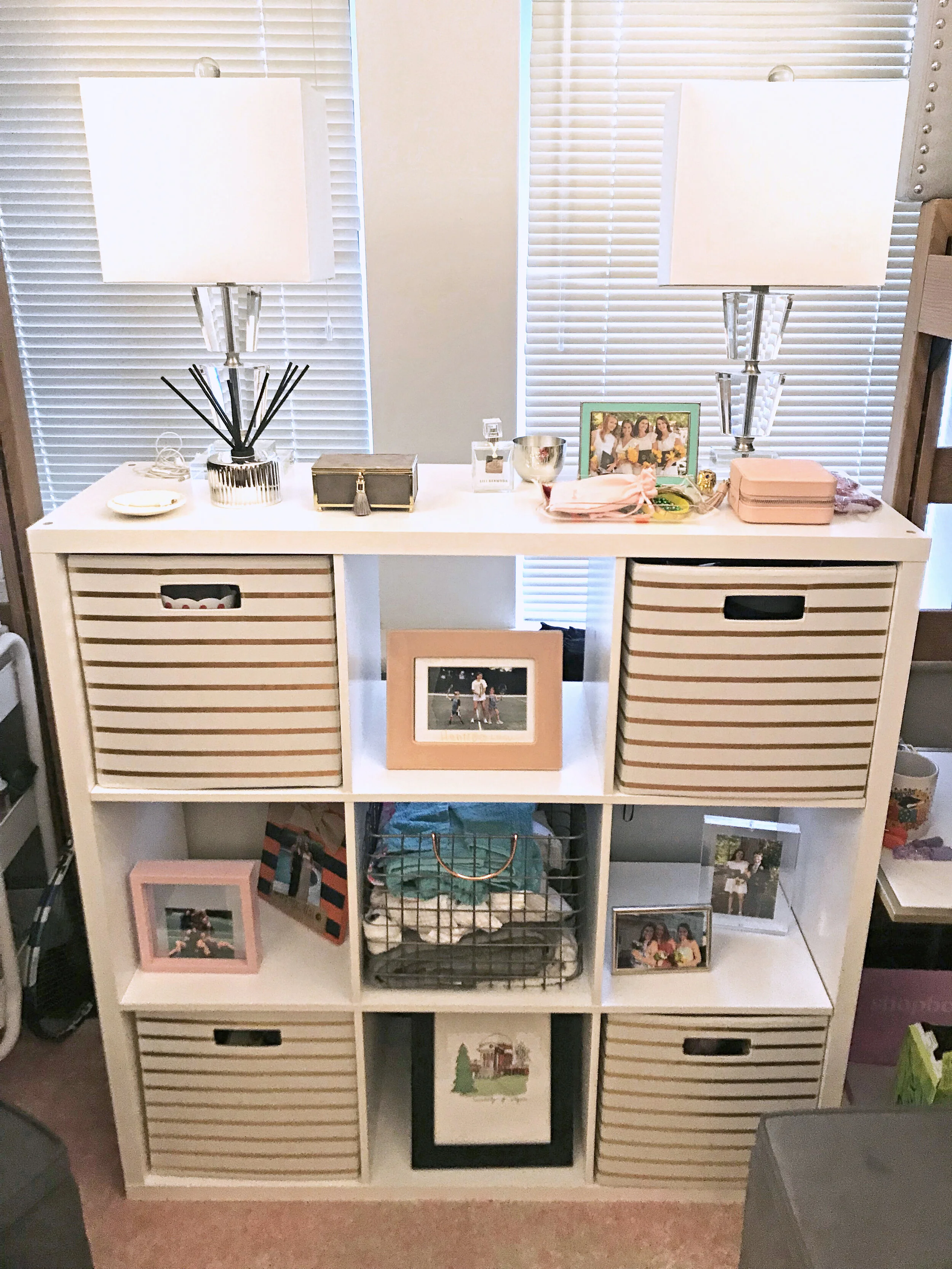
In smaller spaces it’s important to have lots of creative storage to keep things tidy. This book shelf is classic white and the gold striped bins at a contemporary touch.

Framed pictures and photo collages are a special way to keep memories of friends and family close while being away during the year. A great way to also remember to pick up the phone and give them a call to say hi once in a while too.


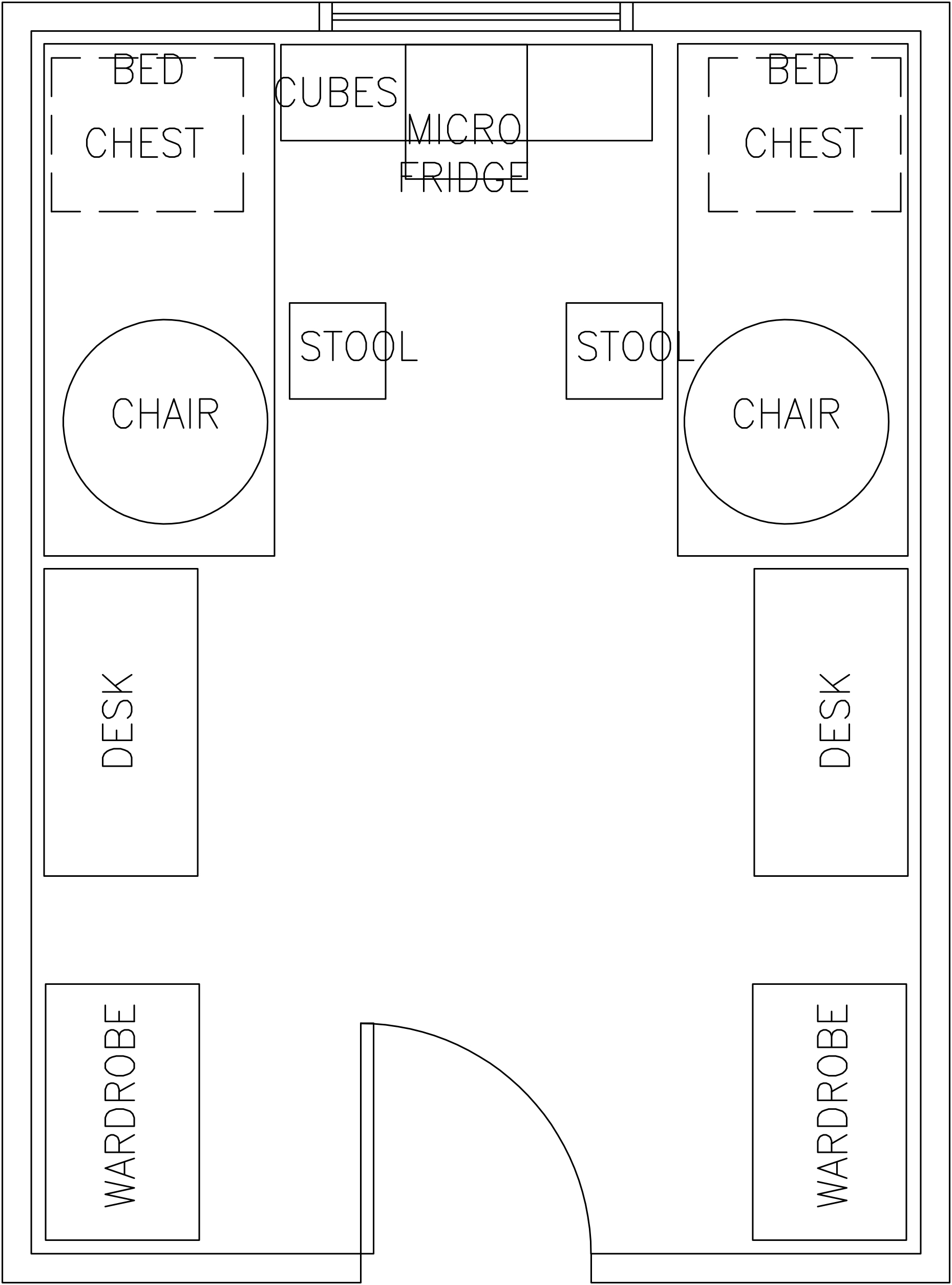
A room schematic helps provide scale and a sense of space

By drawing out a room we show clients ways to maximize their space. This is also helpful to have during move-in or install day to easily place things. Make the most of your room by planning out the placement of furniture storage and seating. We like to measure out rooms to ensure the spacing of furniture is just right and to also find the right size we’re looking for.


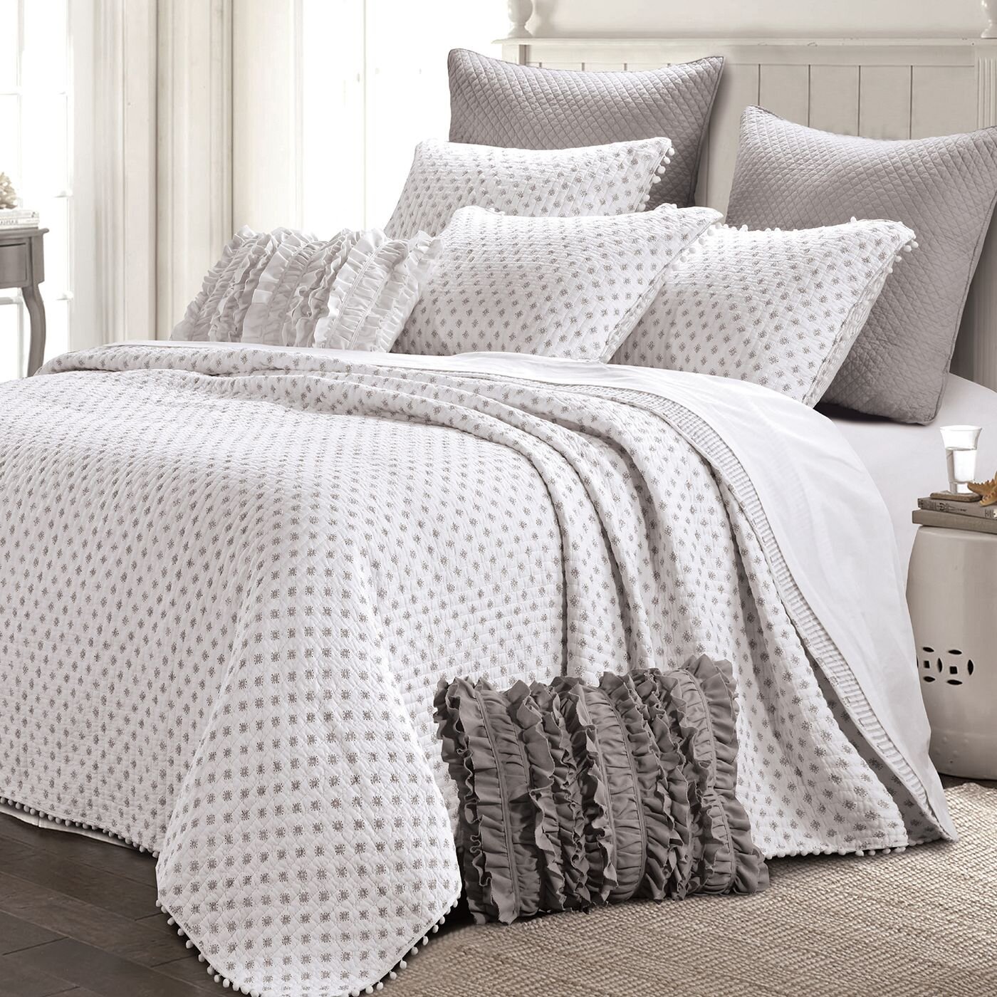
Layering bedding is not only stylish but practical, especially in different climates or seasons. By having a balance in the patterns and textures it delivers a thoughtful sense of design that isn’t an overwhelming theme. We love these subtle colors that bring a calm but still girlish feel to the room. It’s o.k. to still love polka dots and ruffles too just in a paired back way.

CONTEMPORARY ACCENTS


We’re so excited that our client loves their new space. It was so fun collaborating with the student and her mother as we combined their finds together to create a home away from home. Hearing they won for best dorm room design is also pretty amazing too.

Cheers!

Melissa Mathe

Contact us for all your Interior Design and Decorating needs @mathedesign.com

Master Bathroom Remodel: Dover Road Project

Master Bathroom Remodel:
Dover Road Project

“Happiness is taking a long, hot bubble bath.”

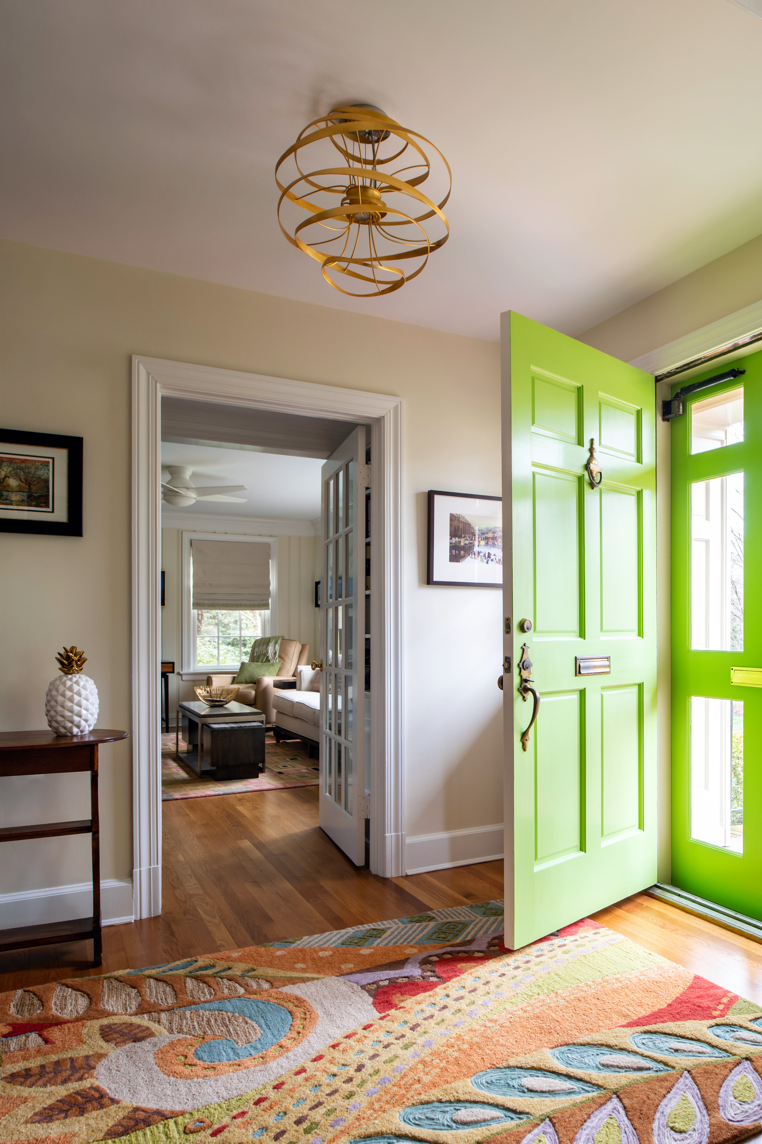
Our dear clients at the Dover Road Project purchased this beautiful home and wanted to make updates to turn their new house into a home for themselves. You may have seen this colorful entryway in our social media posts. However while this vibrant front door is the perfect shade of lively green let us warn you that the green in the before pictures of our clients previous Master Bathroom is well… not (be warned!). One of the major areas that needed attention in this newly purchased home was the Master Bathroom, what once was a very interesting 1950’s tiled bathroom (wink) is now a modern contemporary sanctuary.

Ansel Olson Photography

Ansel Olson Photography

BEFORE: DOVER ROAD REMODEL

What did we tell you… everything from the pink porcelain and mosaic retro tile including toothbrush and soap holders to the retro sink and plastic wavy shower wall had to go. The layout of the bathroom needed to be completely rearranged to add double sinks and privacy for the toilet area. So we decided to take room from the hallway closet area making the new layout workable to include room for a freestanding soaking tub.

This “Before” of the master bathroom proves that it even had a pink toilet… it’s now 2019 and this bathroom deserved to be loved again in a new — clean and contemporary way.

Demo was underway and bit by bit every retro layer was removed…

Screen Shot 2018-12-29 at 1.09.29 PM.png

Even the subfloor was removed to secure the base floor structures, and for quite a while this tape was in place.

After the demo was complete and the plumbing moved the framing could begin, which is always a great point of progress to start for clients. In the meantime finishes needed to be selected… the funny thing about this master bathroom remodel was an interesting compromise between the owners. A humorous understanding was made that since the Misses was able to get a new closet area with added organization she so graciously agreed that the Mister would have way-in to the bathroom design style and choice of finishes. He does like his vanity lighting to be a certain way to start his daily routine… and of course theirs the hair styling which needs to be just right.

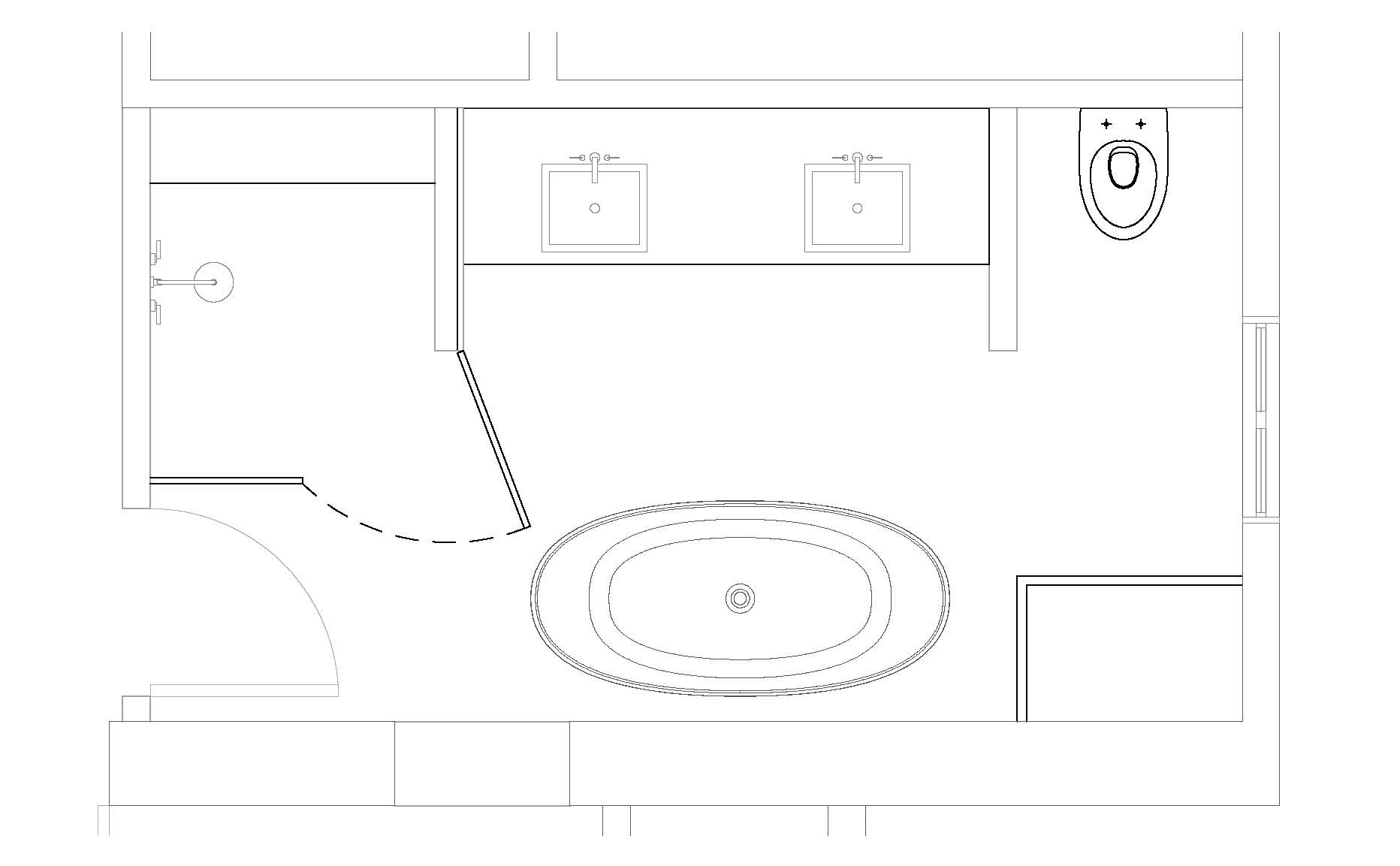
NEW FLOOR PLAN

FINISHES

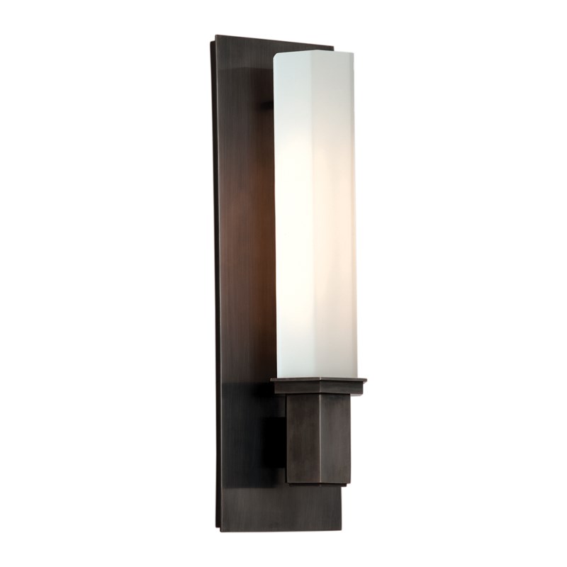
We selected porcelain tile in three versions of the Classic Stone Calacatta Oro — 12 x 24 tile for the shower walls and bathroom floor, basket weave mosaic for the shower floor and hexagon mosaic was installed in two vertical bands creating eye catching visual interest in the space. The wall sconces feature a rich old bronze finish complemented by a hexagon-shaped white glass shade to enhance the decor tying the finishes together.

AFTER: MASTER BATHROOM REMODEL

Ansel Olson Photography

Ansel Olson Photography

Ahhhh the “After”…. while projects of this scope can take several months to demo, plan, get approval and execute. This means that clients have to be extremely patient during the process, as these clients are… and the final reveal you can see is entirely worth the wait.

Ansel Olson Photography

Ansel Olson Photography

This master bathroom is now a dream space that is bright, soak ready and smells a world fresher! Undeniably a current bathroom design that will last for many years to come.

Another happy client has been serviced and a successful project design completed by Mathe Design and our supportive team. We hope you have enjoyed seeing more of the before and after behind the scenes of this remodel. We’re excited to share more projects like this for you in the future. Now… where are those lavander bath salts!

Cheers!

Melissa Mathe

*Contact mathedesign.com for all your Interior Design needs.

Make It Match Holiday Decorating

make it match holiday decorating

“One of the most glorious messes in the world is the mess created in the living room on Christmas Day.”
~ Andy Rooney

Better Homes & Gardens

Better Homes & Gardens

It’s the holiday season… the time of year to make all things merry and bright! From the top of the tree to the center of the Christmas dinner table. You can find pictures of beautifully decorated rooms and you end up with visions of candy canes dancing in your head dreaming of ways to make your home seem just as picture-perfect. But how does this happen?! The approach to making your home feel festive is to ensure your holiday decorations are in the same design style and similar color palette with your everyday interior decor. Bringing these styles together will bring a sense of harmony and flow to your living space. We’ve gathered up ideas for you on ways to achieve this look in your holiday decorating.

spacergraphic_2.png

rich and bold

An elegant combination of purple and green — from the furniture fabric to the ribbons and ornaments — is brought throughout the wrappings to keep everything looking lively and magical. The simple hanging greenery wreath and table floral arrangement add an element of nature that accents the rich and bold garden inspired color theme.

Southern Living

Southern Living

golden glow

Pops of color with a golden glow delightfully blend with this rooms glam furniture, window coverings and fabrics. Dripping icicles, natural pine cones and simple paper garland are what makes this room sparkle and shine.

Traditional Home

Traditional Home

neutral nature

The natural textures in this neutral color scheme bring a sense of the woodlands indoors. Owls, feathers and natural fabric — effortlessly used as a tree skirt — help make the space feel fresh and woodsy sitting upon the large pine boughs. This grand tree is sure to be the center of guests attention.

Traditional Home

Traditional Home

snowy winter white

A light filled neoclassical interior is the perfect clean backdrop for simple holiday touches such as fresh cut sprigs. While the traditional use of bold reds and greens can be busy this space feels bright and airy.

Traditional Home

Traditional Home

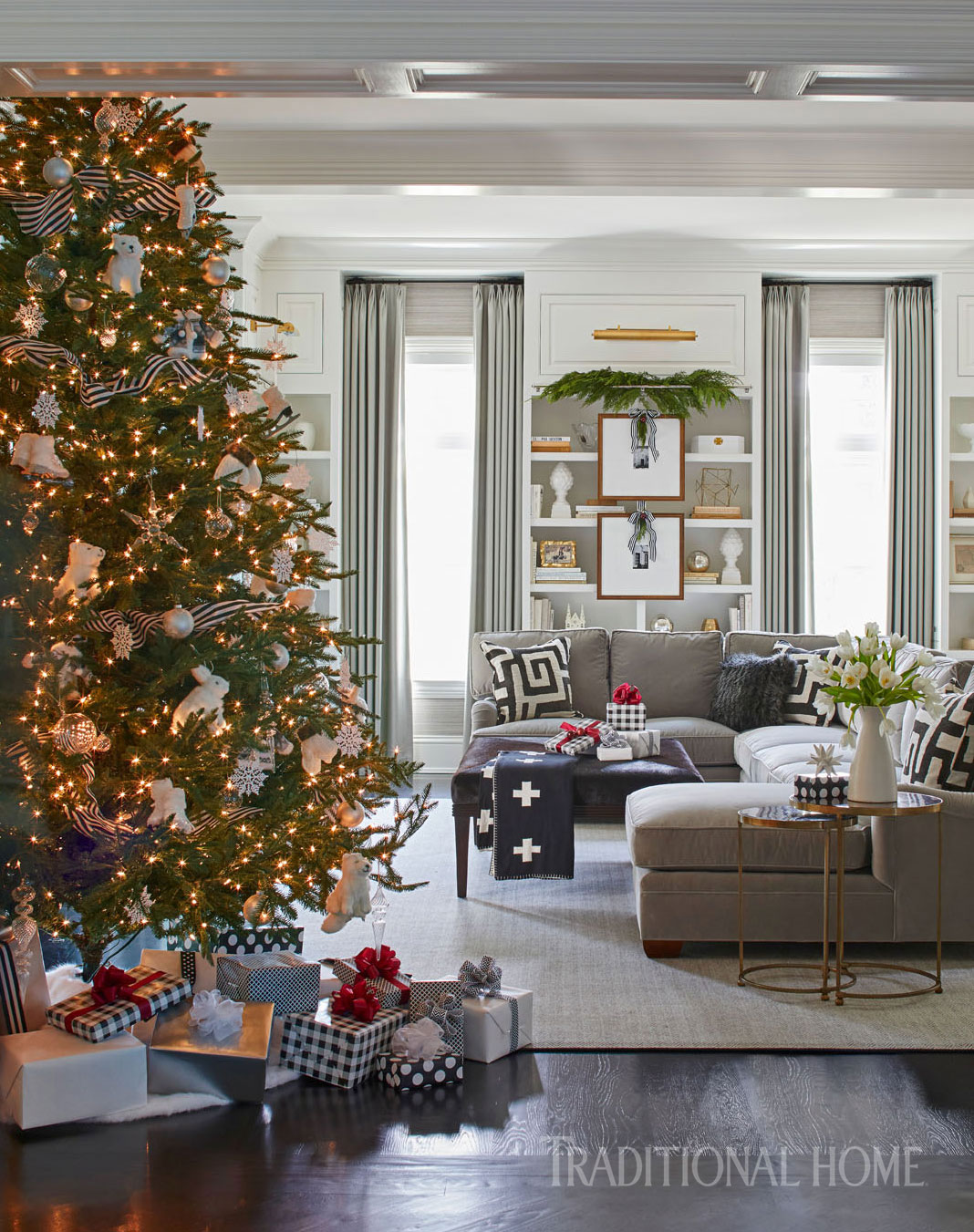
smart style in black and white

Creative yet sophisticated black and white design makes a striking statement. Stripes, polka dots and plaids layer in pattern to enhance the neutral gray decor. Bringing this space to life for those special family moments.

Traditional Home_HolidayHomeinBlackandWhite.jpg
spacergraphic_2.png

While the merry bells keep ringing Happy holidays to you!

Cheers,

Melissa Mathe

Contact @mathedesign.com for all of your Interior Design needs.
Design Crush: Bar Cabinets

design crush: bar cabinets

"You can’t buy happiness but you can prepare a cocktail. And that’s kind of the same thing.”

Bernhardt Furniture

Bernhardt Furniture

With the holidays right around the corner everyone will be gathering around to share special moments with family and friends. We couldn’t help but think it to be the perfect time to talk about great furniture in entertaining. Whether in the living room or dining room a stylish Bar Cabinet can certainly up your cocktail game.

Bar Cabinets are an elegant way to serve your guests. They also free up kitchen space and help provide added storage.

Worlds Away

Worlds Away

You will find there are quite an array of designs, shapes and finishes available in the marketplace. While shopping for your Bar Cabinet furniture keep in mind what your particular needs are. Whether it’s added glass storage, bottle storage or utensil space — there are cabinets with all the bells and whistles including pull out shelves and lighting to suit your fancy.

Lillian August

Lillian August

IMG_1295_1.jpg

With all the excitement around the cocktail hour we’re sharing a few go-to aperitifs for your holiday entertaining!

spacergraphic_2.png

holiday cocktail recipes

CranberrySmash_1178-645x926.jpg

cranberry smash

Ingredients
1 bottle of Gin, 750ML
2 C of fresh cranberries, a few extra for garnish
4-5 sprigs of fresh rosemary
fresh lemon juice from 1 lemon
ice
Instructions
1. Soak Cranberries in gin 1 week.
Put in a large mason jar, and cover tightly.
2. Drain gin into a new bottle and toss
the cranberries.
3. In a shaker, muddle a pinch of chopped
rosemary and lemon.
4. Add 3-4 oz of gin to the shaker with ice.
5. Shake until chilled, strain into a
cocktail glass.
6. Garnish with cranberries on a sprig
of rosemary.
Source: Thyme of Taste; Photo: Aubrie LeGault

BourbonAppleToddy_2.jpg

bourbon apple toddy

Ingredients
6 cups filtered apple cider
1 cup spiced simple syrup (recipe below)
1/4 cup lemon juice; 1 1/2 cups bourbon
Spice Simple Syrup
1 cup raw sugar
1 cup dark brown sugar; 2 cups water
Add water and dissolve sugar in the saucepan
Bring to simmer over medium heat
Add to saucepan 2 oranges Peels
1 1/2 inch fresh ginger, peeled and sliced
1/4 cup crystallized ginger, chopped
4 cinnamon sticks 10 whole cloves
8 whole allspice berries; 1/2 tablespoon sea salt
2 sprigs rosemary; 2 bay leaves
Simmer for 8-10 minutes; Let steep for 2 hours
Remove rosemary, steep overnight
Strain into container
Source: Jamie Coffey Creative Director
at Williams and Sherrill Interiors

Enjoy these sweet sips while having a holiday filled with warm memories of love and laughter…and a few pop. fizz. clinks.

Cheers!

Melissa Mathe

Contact @mathedesign.com for specialty pricing and inquiries regarding your Interior Design needs.

High Point Market Highlights

High Point Market Highlights

"It's a new season, a perfect opportunity to do something new, something bold, something beautiful"


In April thousands of designers descend upon High Point, NC for the bi-annual Market. Commonly referred to as “Disney for Designers”, High Point Market is the largest furnishings industry trade show in the world. It is comprised of 180 buildings, more than 2,000 exhibitors, and 11.5 million square feet of show space. There is so much to see and only four days to see it in. So, Melissa Mathe Interior Design put on our sneakers and hit the streets to check out this year’s hottest trends.

Melissa Mathe at High Point Market

Melissa Mathe at High Point Market

Trend: Color

The first trend we saw is color and the bold use of it. We’re not talking pops of color here and there, we’re talking flooding a room with lively fresh color. Setting the tone for this trend is Pantone’s Color of the Year: Ultraviolet. This bright purple can be paired with lots of vibrant jewel tones: greens as rich as grass, pinks bright as a raspberry, blues that look like the Mediterranean. All of these colors filling a space creating a sense of happiness and life.

Simple Saturday Makeover: Add lots of bright pillows and accessories to liven up your space. Some new table lamps, you can even throw a fun color on your ceiling in high gloss to really make a statement.

Jill Seale Design Studio

Jill Seale Design Studio

Another way to make a bold use of color, is the absence of color with the classic combination of Black and White. Kate Spade and Audrey Hepburn have proven this color combination to be a thing of natural beauty. While being a classic combination, we are seeing black and white being used in strong patterns such as wide stripes, polka dots, and even zebra.

Simple Saturday Makeover: Paint your walls white and your trim black and throw a faux zebra rug on top of a sisal rug for layers of texture.

Bernhardt Furniture

Bernhardt Furniture

Trend: Greige is the new Grey

While we are seeing a shift to more colorful spaces, the neutral room is still en vogue. However, grey is out and greige is in. Greige is the word used to describe “grey-beige” – or warm greys. This is moving back towards the browns, ever so slightly. Greige is the new contemporary sophistication palate for those that may not want to go all in on bold colors. In 2018, we are seeing neutrals in warm tones with subtle uses of complimentary tonal colors paired with pickled wood tones.

Simple Saturday Makeover: Use Benjamin Moore’s Manchester Tan or Collingwood on your walls to set the warm tone for your room. Keep things simple with greige, brown, and white. If you want a pop of color, pick only one color and use it sparingly.

Hickory White

Hickory White

Trend: Fabric on Furniture

One of the hottest trends that I just adore is fabric-wrapped furniture. We saw this some last year, but in 2018, fabric covered furniture has really made its appearance. We are seeing this trend appear in Chests that are wrapped in linen, Bar cabinets with velvet doors, Shagreen-topped game tables. This added texture speaks to your senses. Furniture that you can not only see, but also truly feel.

Simple Saturday Makeover: Update your bedroom with a grass-cloth covered dresser or night stands. It is sure to compliment your existing pieces.

Bernhardt Furniture

Bernhardt Furniture

Interior Design trends are always evolving. Find classic pieces that you can update with the latest trends to always keep your home looking fresh.

Cheers!

Melissa Mathe

*Contact mathedesign.com for specialty pricing, non-priced items and other Interior Design needs.
The Whole Nine Yards In Mink

the whole nine yards in mink

"Simplicity is the ultimate form of sophistication" ~ Leonardo da Vinci

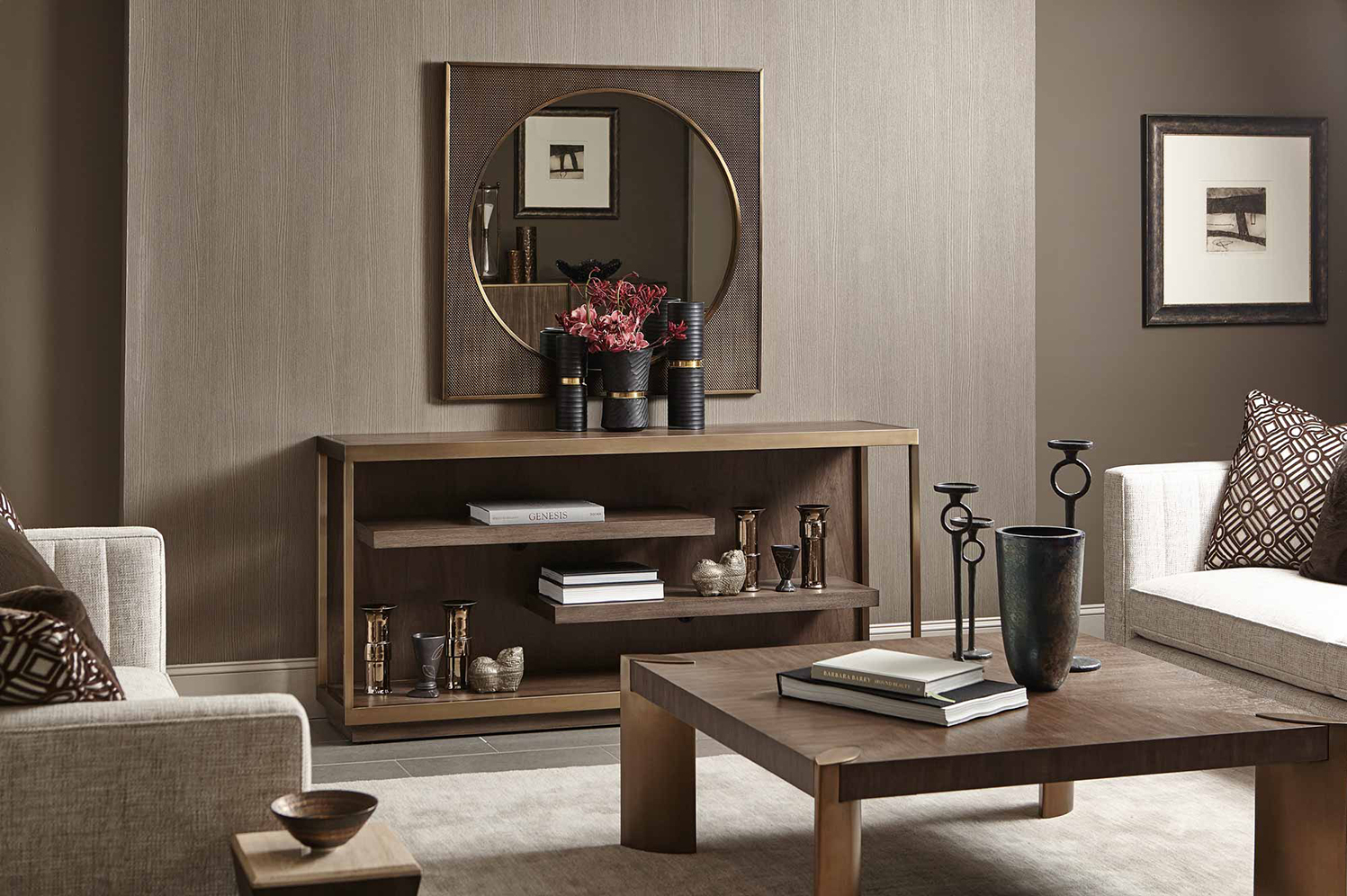
Bernhardt Furniture Company

Bernhardt Furniture Company

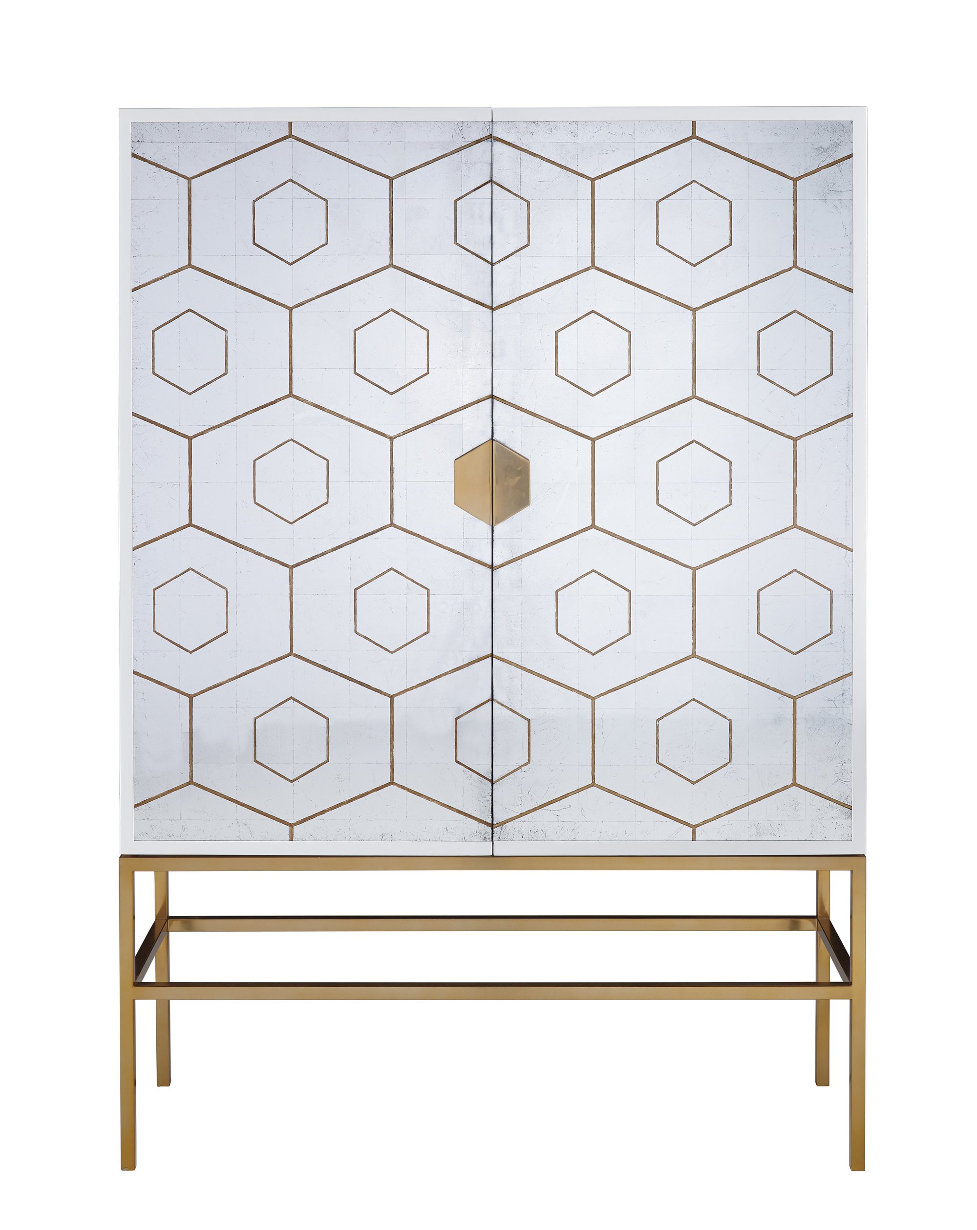
As our economy continues to slowly rise, we see color trends warming up.  Grey will still be around, but you will see the use of warm grey and "greige" (the term given to a grey/beige color). Enter: Mink.

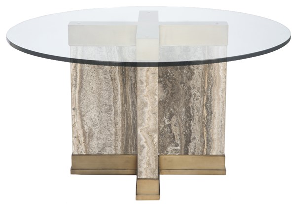
Dreamy neutral interior spaces can transport the aesthetic to an elegant and luxe state.  While subtle accent colors, pattern, and texture play a supporting role in bringing added interest.  We have our eyes on a color we affectionately call "Mink"... doesn't it just sound pretty.  Well, we're pretty excited about adding this decadent color into design schemes to create that neutral clean contemporary feel.  Mink is a rich color that is confident and warm. Using soft creamy colors to provide a serene base and layering in this deep color provides  a sense of grounding to the overall interior style.  This color can be found in all interior furnishings: fabrics, wood tones, tile, and stone.

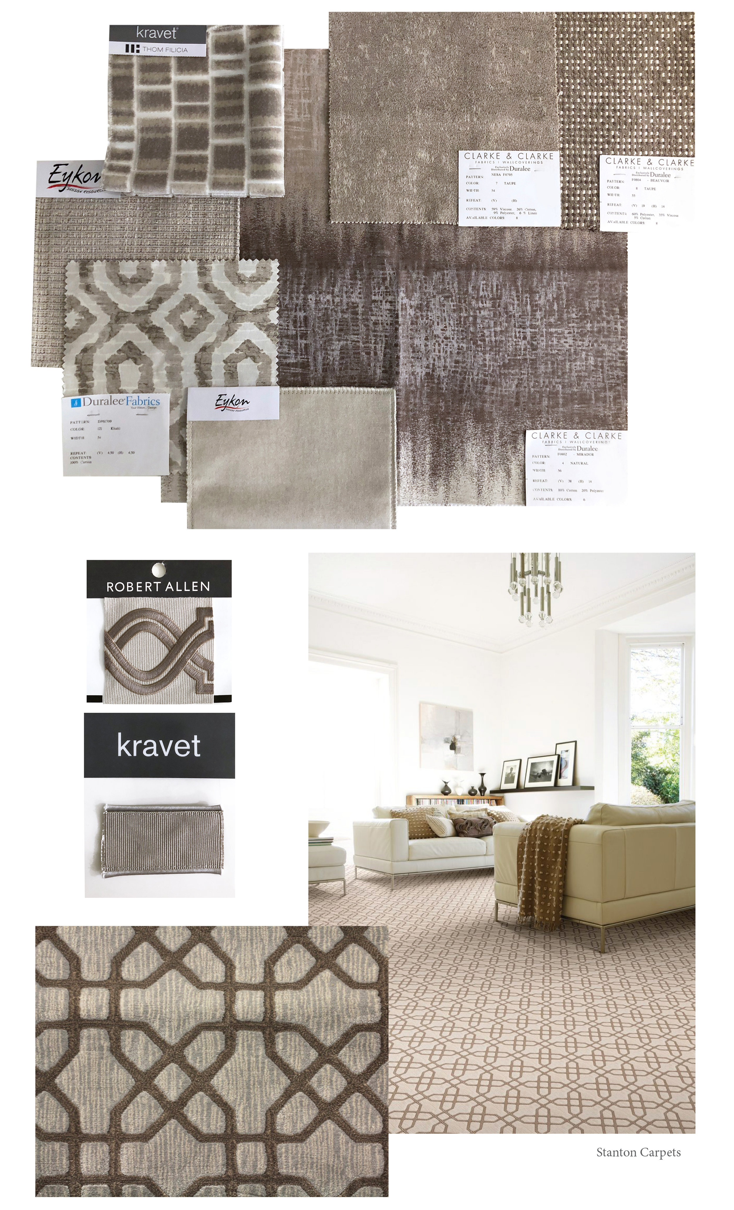
As you can see these fabric selections, trim and carpet are lovely examples that can easily be pulled in - to compliment.  As we've recently sourced furniture and lighting for this aesthetic we have an assortment to share along with a to-die-fo…

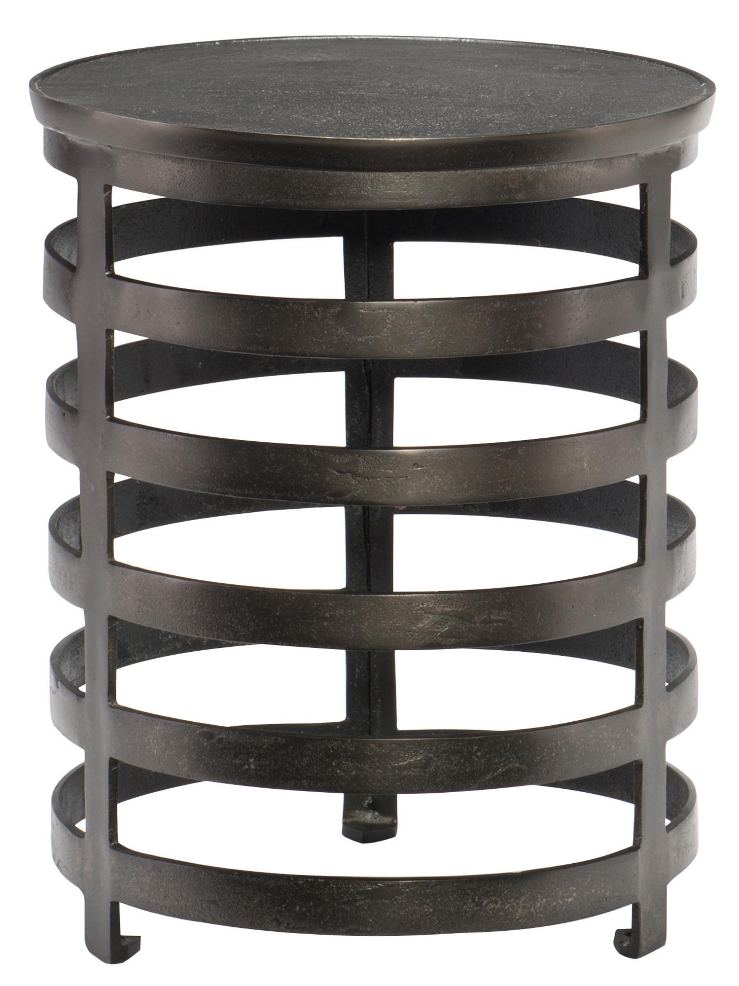
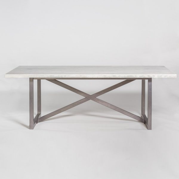
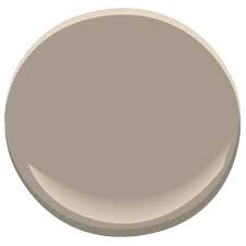
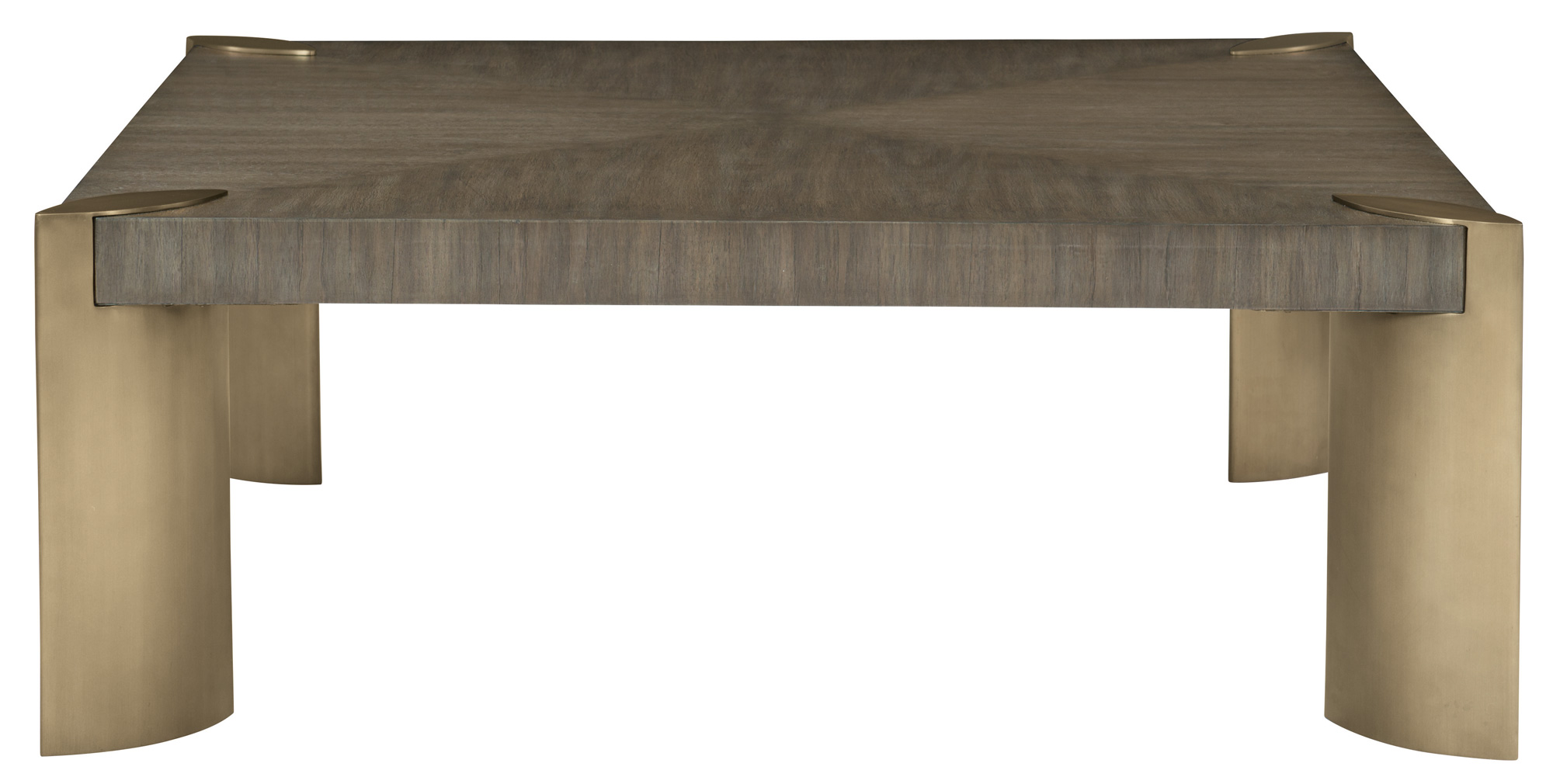
Here are details on neutral furniture and fixtures for your resource. Plus a to-die-for paint color to tie everything together.

We hope you enjoy our new color crush discovery and also hearing more about this luxe style.  We wouldn't hold it against anyone to casually use this color for there next professional manicure either... because we've done it ourselves.

Cheers!

Melissa Mathe

*Contact mathedesign.com for specialty pricing, non-priced items and other Interior Design needs.