Master Bathroom Remodel:
Dover Road Project
“Happiness is taking a long, hot bubble bath.”
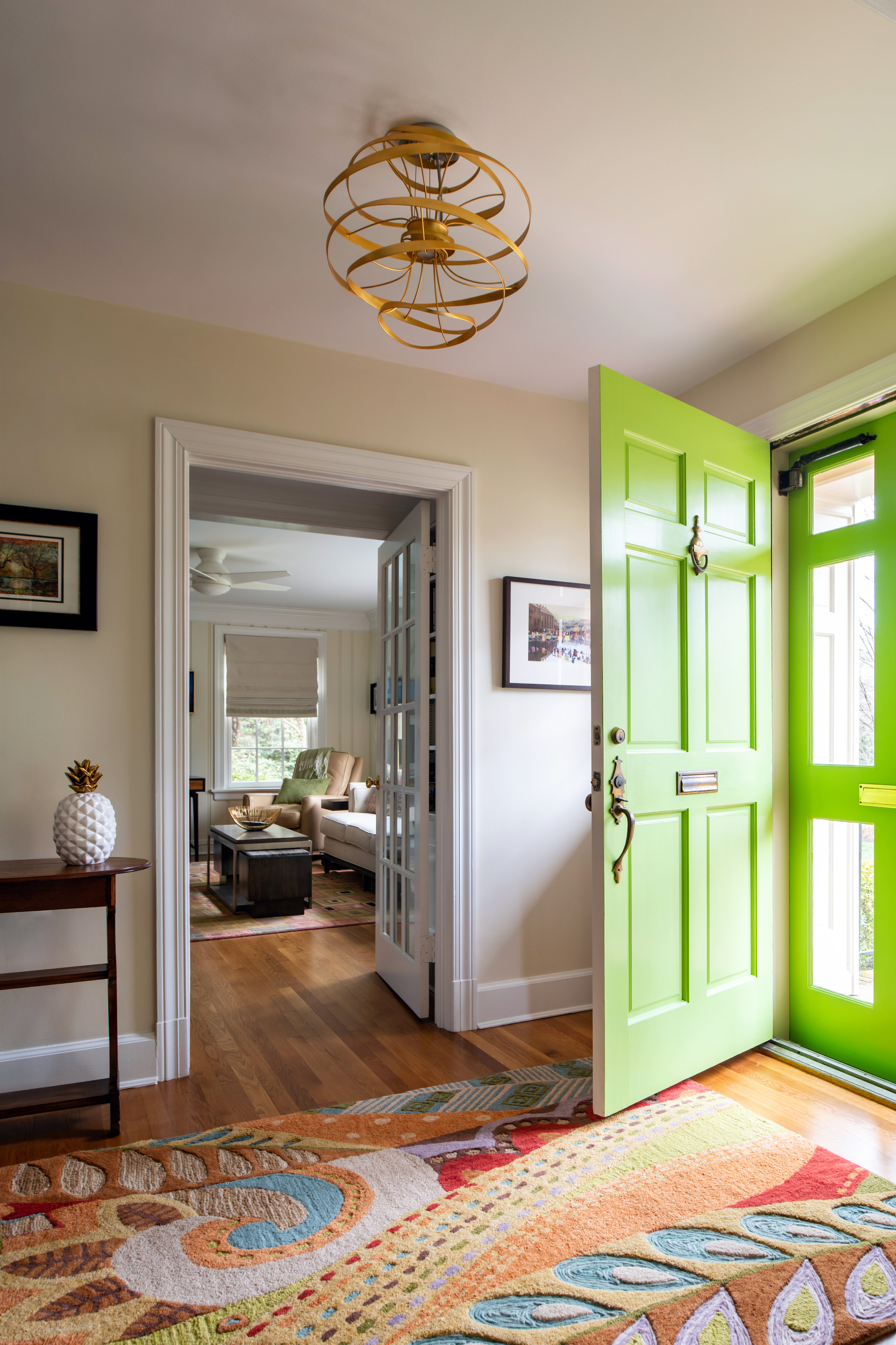
Our dear clients at the Dover Road Project purchased this beautiful home and wanted to make updates to turn their new house into a home for themselves. You may have seen this colorful entryway in our social media posts. However while this vibrant front door is the perfect shade of lively green let us warn you that the green in the before pictures of our clients previous Master Bathroom is well… not (be warned!). One of the major areas that needed attention in this newly purchased home was the Master Bathroom, what once was a very interesting 1950’s tiled bathroom (wink) is now a modern contemporary sanctuary.
Ansel Olson Photography
BEFORE: DOVER ROAD REMODEL
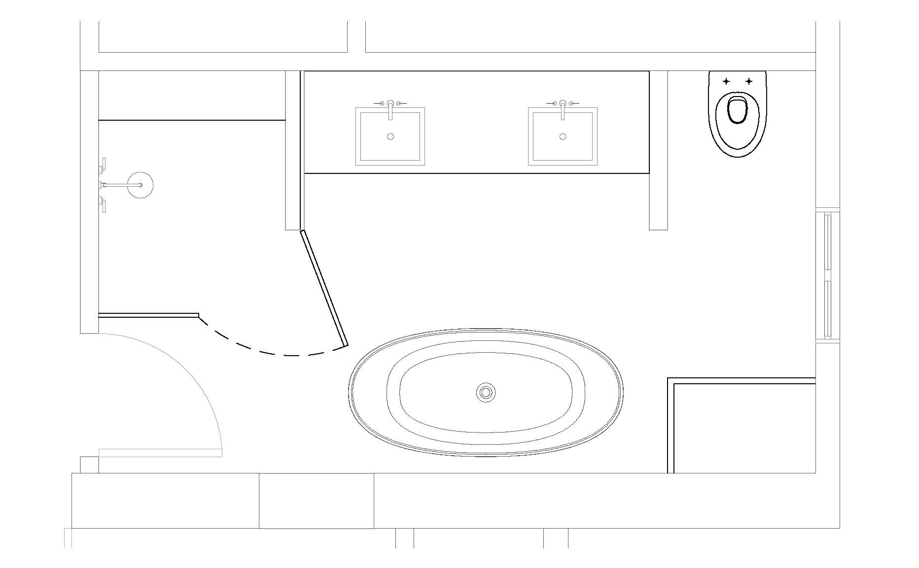
What did we tell you… everything from the pink porcelain and mosaic retro tile including toothbrush and soap holders to the retro sink and plastic wavy shower wall had to go. The layout of the bathroom needed to be completely rearranged to add double sinks and privacy for the toilet area. So we decided to take room from the hallway closet area making the new layout workable to include room for a freestanding soaking tub.
This “Before” of the master bathroom proves that it even had a pink toilet… it’s now 2019 and this bathroom deserved to be loved again in a new — clean and contemporary way.
Demo was underway and bit by bit every retro layer was removed…
Even the subfloor was removed to secure the base floor structures, and for quite a while this tape was in place.
After the demo was complete and the plumbing moved the framing could begin, which is always a great point of progress to start for clients. In the meantime finishes needed to be selected… the funny thing about this master bathroom remodel was an interesting compromise between the owners. A humorous understanding was made that since the Misses was able to get a new closet area with added organization she so graciously agreed that the Mister would have way-in to the bathroom design style and choice of finishes. He does like his vanity lighting to be a certain way to start his daily routine… and of course theirs the hair styling which needs to be just right.
NEW FLOOR PLAN
FINISHES
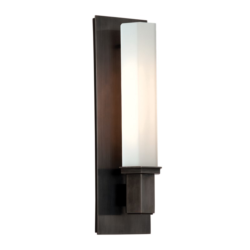
We selected porcelain tile in three versions of the Classic Stone Calacatta Oro — 12 x 24 tile for the shower walls and bathroom floor, basket weave mosaic for the shower floor and hexagon mosaic was installed in two vertical bands creating eye catching visual interest in the space. The wall sconces feature a rich old bronze finish complemented by a hexagon-shaped white glass shade to enhance the decor tying the finishes together.
AFTER: MASTER BATHROOM REMODEL
Ansel Olson Photography
Ahhhh the “After”…. while projects of this scope can take several months to demo, plan, get approval and execute. This means that clients have to be extremely patient during the process, as these clients are… and the final reveal you can see is entirely worth the wait.
Ansel Olson Photography
This master bathroom is now a dream space that is bright, soak ready and smells a world fresher! Undeniably a current bathroom design that will last for many years to come.
Another happy client has been serviced and a successful project design completed by Mathe Design and our supportive team. We hope you have enjoyed seeing more of the before and after behind the scenes of this remodel. We’re excited to share more projects like this for you in the future. Now… where are those lavander bath salts!
Cheers!
Melissa Mathe
*Contact mathedesign.com for all your Interior Design needs.
